Lead Product Designer
Exploring data in every context
Turning crop production and crop performance data into spatial understanding, explorable from national food security policy down to individual field conditions
Turning crop production and crop performance data into spatial understanding, explorable from national food security policy down to individual field conditions
5 monitoring contexts shipped on the same pattern
Crop Production, Fertiliser Subsidy, Water Stress, Crop Health, and Soil Exposure, each a distinct surface, all driven by the same spatial layer, navigation, and drill-down model.
From 5 months to 2 months per new context
First context (Crop Production) took five months from design to ship. By the fourth, the pattern was stable enough to ship a new context in two, the system became its own multiplier.
Used across 3 country governments · ~8 sessions/day
Active in production with food security advisors and ministry analysts across three governments, averaging eight monitoring sessions per day.
Food security is the outcome of many conditions, tracked separately, by different teams, across different timescales, with no shared view.
The key variables:
Countries can access some of this data, through various ministries and regional offices. What didn't exist was a way to see all of it in the same place.
The result was that decisions were made on guesswork. Officials requested data from regional offices, waited weeks for responses, received inconsistent formats, and manually reconciled everything into a picture already out of date. No one could see how drought in one region connected to food security risk in another. The numbers existed, but they couldn't be read together.
So that decision-makers can act on a reliable, current picture of food security, knowing which regions are at risk, which indicators are deteriorating, and what the intervention window is. Without this, decision-making is reactive: action only follows after a crisis has already materialised.
From Agriculture Intelligence, Visual Explorer is the surface that responds to this goal.
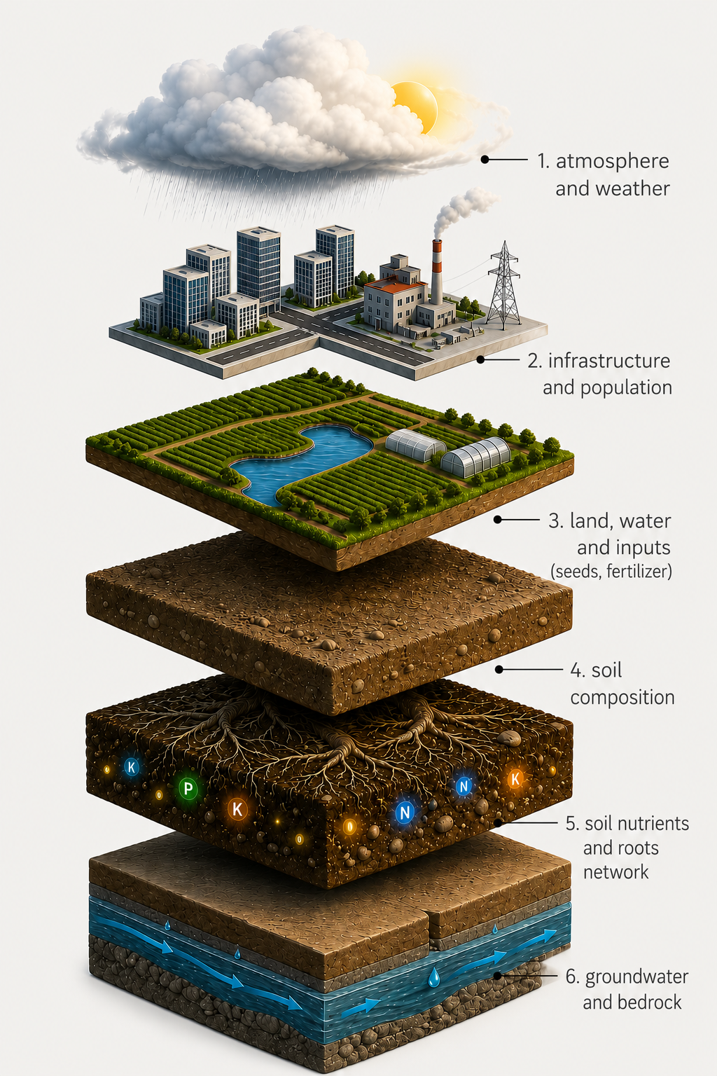
Before designing anything, we mapped the analytical requirements, the behaviours, frequencies, and information volumes that the system had to support for a user like Mayeso.
An analyst spends weeks gathering and reconciling data, then has days — not weeks — to act on it. Six numbers capture the cost of that gap, and what the system had to compress.
Each monitoring context had its own question, its own visualisation, and its own level of detail depending on who was looking at it. Building for one context first would have locked the system into a shape that didn't extend. The goal was a replicable framework, something that works for crop production and works equally for water stress, crop health, and any context added later.
The data has to move across four dimensions at once. Build for one and the system locks in. Build for all four and the surface becomes legible at every scale.
Crop production, water stress, fertiliser, health — each with a different question, visualisation, and audience.
The same signal reads differently at national, district, and field level — resource allocation vs deployment vs irrigation.
Every context has a temporal axis — week-over-week, season-over-season. Static views can't hold it.
Aggregate signal, per-crop breakdown, field-level anomalies — the hierarchy doesn't stop at the administrative boundary.
We explored four ways to structure the two primary axes — contexts and administrative levels. Approach D won because it kept the country itself as the constant: contexts switch as overlays on top, so the user never loses the geographic frame.
Each context — production, subsidy, water stress, crop health — answers a different domain question, but the design framework is the same. Three decisions, repeated for every context the platform supports.
Every context starts with the question being answered — what is a ministry official, district analyst, or extension worker trying to decide right now? — not with what data we happen to have.
The same signal reads differently at national, district, and field level. Each tier needs its own threshold for what to surface.
Gradient tiles, masks, comparative views — picked from the question, not from the data type.
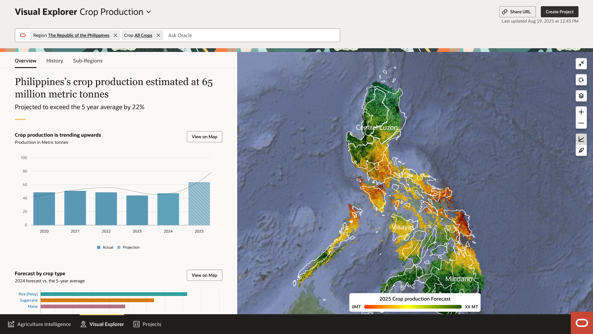
Production is the credibility layer. If an analyst can load a map and see — at ward level, validated from space, without a data request — the same numbers their team spent two weeks assembling manually, they start to trust the system. That trust is what makes every other context usable. So the questions here are foundational, and the answers have to be unambiguous.
Over nine years, Kenya spent approximately US$310 million per year on fertiliser subsidies. There is no conclusive evidence the programme improved crop production. The subsidy existed; the data did not. The question this context has to answer is the one decision-makers spent a decade unable to: did the money land where it was supposed to, and did it move the signal on the ground?
Beyond government data, Visual Explorer holds a family of satellite-derived monitoring signals: Water Stress, Crop Health, Nutrient Deficiency, Canopy Structuring, Pest & Disease, Deforestation, Degrading Land, Soil Exposure. Eight contexts, one scaffolding. The design challenge wasn't which spectral indices to use — that's an agronomy decision. It was deciding which signals a ministry official can act on directly, and which need a data specialist to interpret. That distinction shapes what the map shows.
The first version of Visual Explorer worked at provincial level. It was the right call for where the engineering was. It was the wrong answer for what users needed. Drag the slider to see what changed.
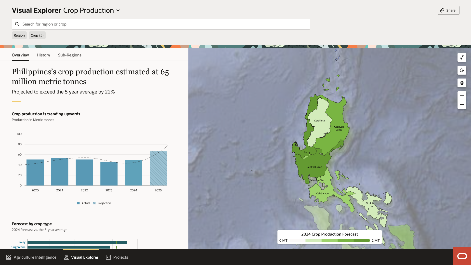
V1 used regional block colours, each province assigned a single colour from its averaged index value. Clean to read from a distance. But averaging is epistemically dangerous in spatial data: a province that is 80% performing and 20% severely stressed reads as "mostly fine." The ward with the failing maize is invisible inside the provincial mean. The data existed, structured in a way that made the signal disappear.
V2 renders Sentinel-2's native 10m data directly through a pre-processed tile system, no aggregation step. Each tile reflects the actual ground-level signal for that specific location. A field under water stress shows as stressed regardless of the provincial average around it. The map is no longer a summary of the data — it is the data, distributed as it actually exists across the landscape.
The shift from V1 to V2 wasn't aesthetic, it changed what the system could be used for. Block colours work for national narrative. They are useless for any decision that requires knowing where within a region a problem is occurring. V2 tiles made Visual Explorer functional across the full hierarchy. An extension worker at field level and a minister at national level see the same data, rendered at the truth relevant to their scope, not a smoothed approximation of it.
If you frame this as "we built a map for crop production," you undersell it.
Visual Explorer solved three problems in the crop production and performance context. First, it grounded abstract data in geography, users could finally see where things were happening, not just what was happening. Second, it enabled hierarchical exploration, users could move from national insights to field-level validation without switching tools or losing context. Third, it supported comparison, across regions, across time, and across levels of detail.
But more subtly, it did something else. It allowed users to build and test their own understanding. They could form a hypothesis at a high level, then zoom in to validate it. They could question the system and either confirm or challenge its outputs. That shifted the platform from a reporting tool to an analytical system.
And everything that came later, subsidies, stress detection, AI-generated insights, scenario planning, only worked because this foundation was in place. You cannot interrogate a system you don't trust. Visual Explorer built that trust. One scale at a time.
Against the benchmarks we set at the start, the shifts looked like this:
"We created a system that allows users to move from uncertain data to informed judgement, across multiple levels of abstraction."
The temptation on a project like this is to stay where it's easy — design the surface, label the layers, ship the map. The harder work is going further down: understanding how a ministry officer in a capital actually thinks about a region, and how a programme worker on the ground actually thinks about a single field, and making the platform fluent in both. Information has to flow both ways — top down when policy is being shaped, bottom up when reality is being reported — and the interaction has to feel the same in either direction.
What I took from this work is that good design comes from grounding decisions in real data, not in what felt elegant in the moment. You learn what to surface and what to leave behind by watching how people who don't think like designers move through the product. Keep the patterns consistent, and the system stays usable long after you stop touching it.