Selected works
Senior Product Designer · 2024–present · Oracle

Making sense of agriculture

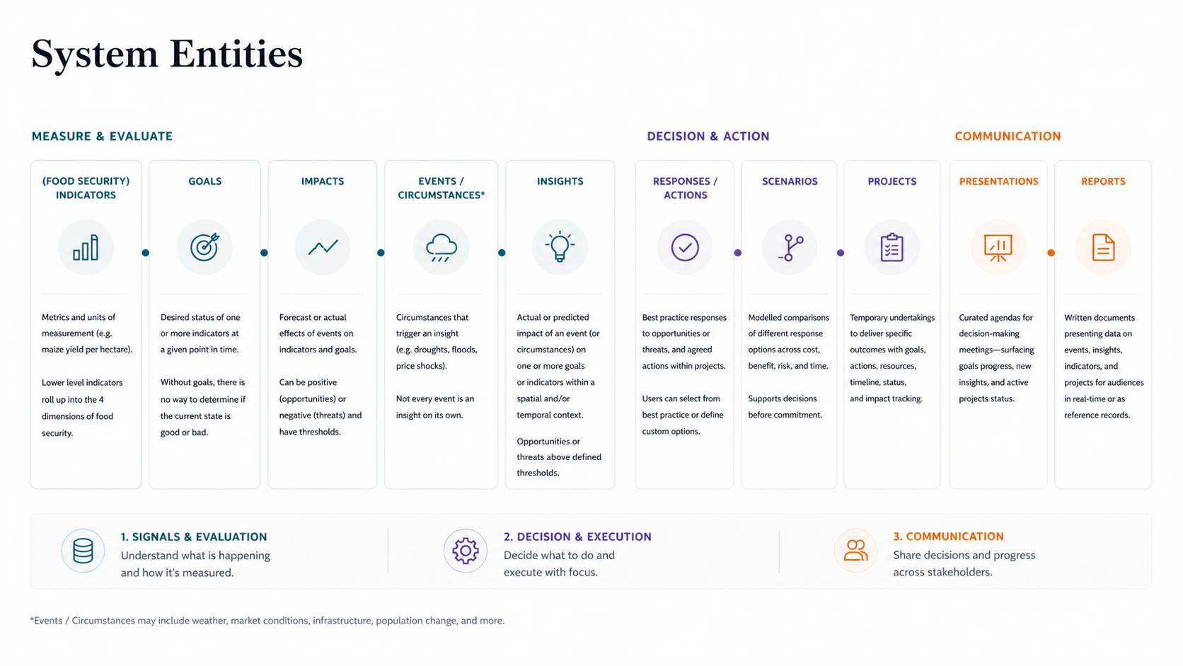
Agricultural decision-making at national scale is built on an uncomfortable reality: the data is incomplete, delayed, and often unreliable. I designed the intelligence system that helped governments move from that uncertainty to confident action.

Timeline
Year 0–1 
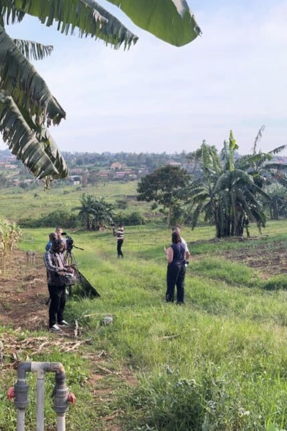
Research & partnerships
Year 1–2 
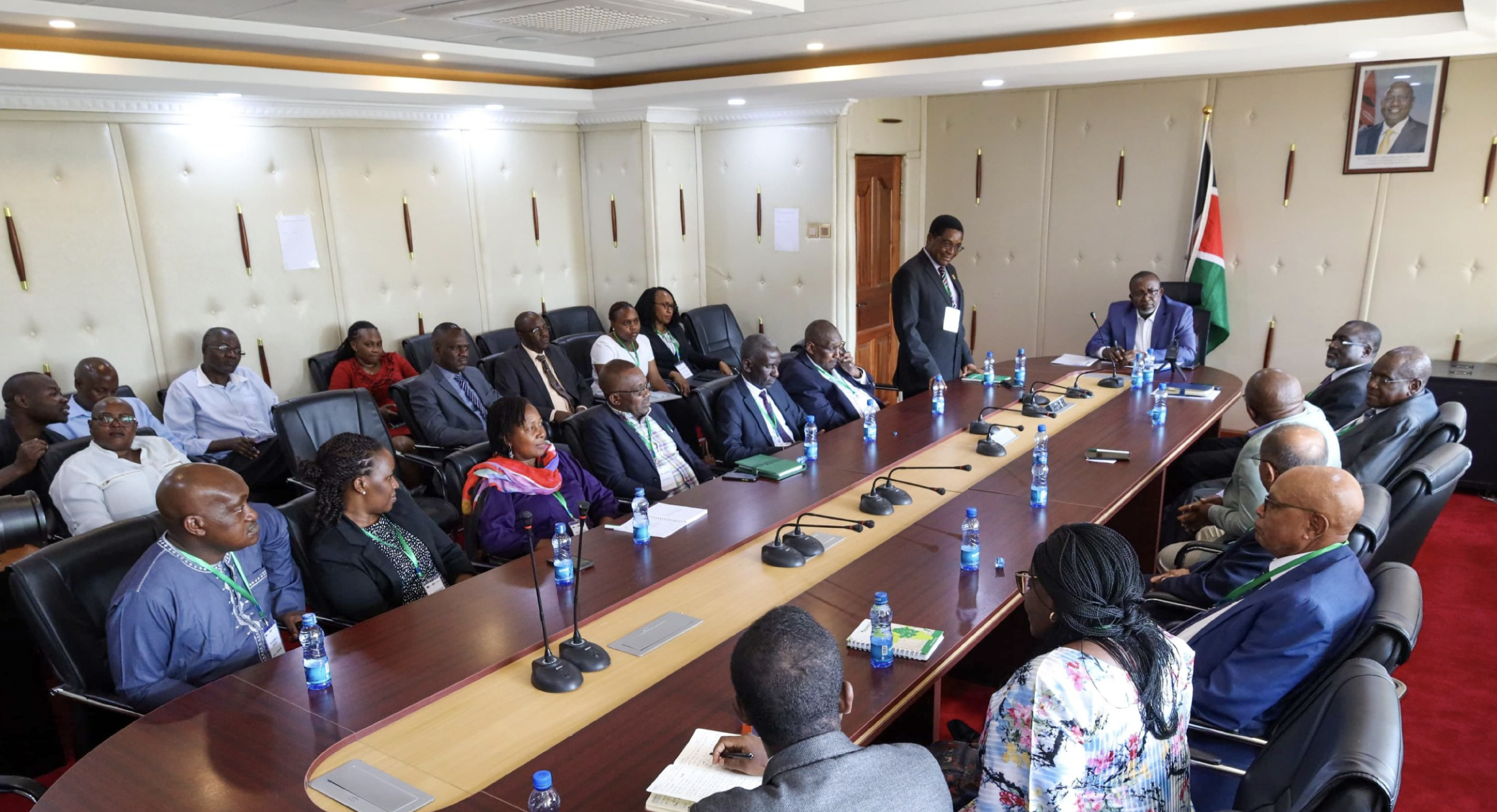
Testing, first governments
Year 3+ Country 4, still moving Now
Design process
I · Listen Four-country research
II · Synthesise Trust deficit
III · Design Entities, surfaces, layers
IV · Deploy Live in three governments
M · 01 The signal Governments managing food security on data that is incomplete, delayed, and often unreliable.
M · 02 Four countries Rwanda, Kenya, the Philippines, Albania — interviews with ministry officials, district agronomists, field surveyors.
M · 03 Trust deficit Not a data shortage. Fragmented sources, incompatible frequencies, no shared model. Lacking clarity, not data.
M · 04 Entity model Indicators → Goals → Events → Insights → Responses → Projects. Common vocabulary across every surface.
M · 05 Three surfaces Insights, Visual Explorer, Projects — same entities, different jobs.
M · 06 Ground Truth Field data calibrates satellite classification. Without it, every signal is just an estimate.
M · 07 AI layer Cuts across all surfaces — ranking, interrogation, scenario planning. Comprehension on top of structure.
M · 08 Three governments live Deployed with food security advisors. ~8 monitoring sessions/day. Decisions move from reactive to anticipatory.
Impact

Deployed across three governments

Rwanda, Kenya, the Philippines, live in production, with more countries in active conversation.

Showcased at World Tech Summit

Presented as a model for data-driven food security intelligence to governments across the region.

End-to-end system design, built from zero

Entity model, information architecture, and every product surface, I owned the full design of the system.

Problem

Food security is a systems problem disguised as an agricultural one.

Food security is growing faster than the systems designed to address it. The margin for error in government decision-making is shrinking — a delayed decision is the difference between an early intervention that contains a crisis and an emergency response that arrives after families have already gone without.

Most teams treat this as a data-availability problem: more sources, more dashboards, more imagery. It was never an access problem. Governments had more data than they could process — the work was making it interpretable, trustworthy, and actionable.

295M
Acutely food insecure

people experiencing acute food insecurity in 2025

Doubled since 2020

global food insecurity has doubled in the last five years

+60%
By 2050

more food needed, with little room to expand farmland

"Rainfall was scarce this planting season. Everyone knew there would be a problem, but there wasn't enough evidence to justify action, so we had to wait until the impact materialized."

RwandaDistrict agronomist

"I meet with all the sector agronomists monthly to collect production data. But I'm never sure how much I can trust the data, there's always a strong incentive to present it in a certain way."

RwandaMinistry of Agriculture official

"Our challenge isn't food scarcity, it's keeping rice affordable. Even small shifts in price cause anxiety, families worry less about finding rice and more about whether they can afford it week to week."

PhilippinesFood security advisor

"I spend weeks chasing data from different ministries. After compiling it, I have one hour to convince dozens of stakeholders. Instead of planning next steps, we debate the data, its gaps, or its reliability."

KenyaNational food security analyst

Governments are not lacking data. They are lacking clarity.

Role & Context

My role and how we worked

This work was built within Oracle's Digital Government team, in partnership with the Tony Blair Institute. TBI is a global policy organisation with deep subject expertise and established relationships across governments in Rwanda, Kenya, the Philippines, Albania, and others. They had cross-country visibility into how food security challenges overlap, the policy constraints, the data gaps, what governments actually have access to, and what ministers will and won't act on. Oracle built and ran the platform; TBI brought the policy intelligence that shaped what the system needed to do.

As Senior Product Designer, I owned the design of the entire system, from the entity model and information architecture through to the interface patterns used by agronomists in the field.

Research

Building understanding before building anything

Before any design work could begin, we needed to understand the domain deeply, not just what food security meant in policy terms, but how it actually functioned across different governments, what data existed, what the science behind it looked like, and how current tools were falling short. That required multiple layers of research running in parallel.

01 Desk research

Existing literature, global food security reports, indicator frameworks, and prior data from multiple countries, to build a baseline before any field visits.

02 University partnership

We partnered with academic researchers to understand the science behind food security indicators and satellite-based crop classification, what the models could detect, where they were uncertain, and what that meant for how the data could be used.

03 Expert and government interviews

Subject matter experts, ministry officials, district agronomists, and TBI policy advisors across Rwanda, Kenya, the Philippines, and Albania, understanding problems at every level of the food security system.

04 Data science collaboration

Close work with the internal data science team to understand how the underlying models worked, where confidence lived in the data, what could be reliably surfaced, and what required human validation before it reached a user.

Field research, ground-level conversation with a smallholder farmer
Field research, surveying farmland with a regional agronomist
Field research, in-context interview during a planting season visit
Field research, ministry session reviewing district-level data

What the research surfaced, consistently across every country and method, was the same three underlying problems, regardless of crop, region, or government structure. Those problems became the design brief.

Personas

The people it had to work for

Five roles across the administrative hierarchy, from ministry advisors setting national policy to smallholder farmers working a single plot. Each operates at a different scale, with different data access, different decision windows, and different consequences when information arrives too late.

User goals

Three core goals, every country.

I
As a food security advisor
I need a clear, actionable picture of the food system status and intervention options

So that decision-makers can act on a reliable, current picture of food security, knowing which regions are at risk, which indicators are deteriorating, and what the intervention window is. Without this, decision-making is reactive: action only follows after a crisis has already materialized.

II
As a food security advisor
I need to inform on the best options to take action, based on cost, benefit, and time considerations

So that governments can commit resources to the right interventions, not defaulting to familiar responses because assembling the evidence to justify a different approach takes longer than the decision window allows. A wrong intervention in food security compounds over seasons, not just weeks.

III
As a food security advisor
I need to track short and long-term effectiveness of the actions taken

So that governments build institutional knowledge that survives personnel changes, and can progressively improve their response strategies based on what actually worked, not what was most visible or politically expedient at the time.

The current state

The current state

The current state grounds the problem in observable behavior, the work as it runs today, the people running it, and the friction at each step. It separates what we assume from what we've seen, and sets the bar for what any design has to actually solve for.

01 Meeting incoming
M
Day 0
02 Logging in
M
Same day
03 Hunting the data
M
1 wk after
04 Manual merge
M
Mid-week
05 Massive sheet, no direction
M
Next day
06 Charts from scratch
M
Day 2
07 Drought, too late
M
3 days after
08 Meeting, no decisions
M
Meeting day
09 Cycle repeats
M
1 mo after
Read the full current-state script — nine stages of friction
Current state: fragmented, manual, reactive
MR
Mayeso Rukundu Ministry of Agriculture Analyst
01 Major meeting coming, data scattered

Mayeso has a major meeting coming up with government leaders, where she'll need to present updates on the country's food production trends and how it's affecting food security.

Mayeso is already dreading the process, the data she needs is scattered across various sources, and she knows it's going to take significant effort to pull it all together.

Pain point Fragmented data Time consuming process
02 Multiple systems, inconsistent formats

Mayeso starts her workday by logging into several government systems. She opens multiple spreadsheets and databases, each in inconsistent formats. Some files are missing critical information, and she knows she'll have to fill in the gaps later.

She can't help but feel overwhelmed, knowing it will take days—if not weeks—just to get the data organized.

Pain point Inconsistent formats and missing data make it hard
03 Searching for data by year, county, crop type 1 week after

Mayeso spends the better part of the week searching for relevant crop production data by year, county, and crop type. For some counties, the data is incomplete or outdated, meaning she will have to contact regional offices to request updates.

This adds another layer of complexity to an already tedious process.

Once she finally finds the files she needs, Mayeso begins downloading them to her computer. The process is slow, with large file sizes and sluggish server speeds holding her back.

Pain point Missing data delaying her process
04 Merging data from multiple files

Now, Mayeso faces the challenge of merging data from multiple files into one spreadsheet. She spends hours aligning columns, correcting formats, and ensuring the data is consistent.

Every step requires careful attention to detail because one mistake could compromise the entire analysis.

Pain point Manually merging data is time-consuming and prone to errors
05 A massive spreadsheet and no clear direction Next day

After hours of cleaning the data, Mayeso is left with a massive spreadsheet and no clear direction. The numbers blur together, and she struggles to understand what data she should pull for leadership.

She knows there's valuable information here, but it's hard to pinpoint what matters most.

She decides she'll need to spend more time digging through the data, trying to pull out information that could help guide decisions.

Pain point Overwhelmed by a massive spreadsheet and unsure of what key information to pull for leadership
06 Creating visualizations from scratch

Mayeso finally begins creating visualizations. Using Excel, she develops pivot tables and charts to show trends in crop production over the past decade, comparing them with future projections.

As she works, she feels drained but focused. She knows that if any errors slip through, it could impact the conclusions she draws.

Pain point Creating visualizations is slow and labor-intensive
07 Discovering drought impact, too late to act 3 days after

With the visualizations complete, Mayeso starts analyzing for trends. She quickly realizes the extent of the drought's impact in Trans-Nzoia, much of the crops are already dead, and the damage is irreversible.

It's frustrating because by the time she uncovers these data points, it's too late to take meaningful action. Even worse, all the data she has is historical, leaving her no insight into how the situation might evolve.

Pain point Reacting when it's too late, rather than using it proactively to prevent the damage
08 The day of the meeting, no decisions made Day of the meeting

On the day of the meeting, Mayeso is anxious. Despite her efforts, leaders focus on missing data from key regions.

Unable to trust the report, they spend the entire meeting asking clarifying questions she can't answer.

No decisions are made, leaving Mayeso feeling unprepared and defeated.

Pain point Missing or incomplete data leads to tough questions from stakeholders, making Mayeso feel unprepared and incompetent
09 Back to revising, the cycle repeats One month after

Following the meeting, Mayeso is asked to address several issues raised by leadership. She must go back, fill in missing data, and revise her report.

This means reaching out to regional offices and revisiting her analysis, adding more time to the project. She feels exhausted, realizing much of the work will need to be redone, delaying decision-making. Worse, the next chance to talk about this is months away, by which time the work might be irrelevant.

The future

What the workflow looks like when the friction is gone

The future state is the same workflow with the friction gone, written as behavior and outcome, not as interface. Keeping it solution-agnostic forces specificity about what "better" actually means before any decisions about how to build it.

01 Signal surfaces
M
Day 0
02 Briefing stakeholders
M
Same day
03 Investigating the why
M
Same day
04 Map view, country-wide
M
Same day
05 Spotting a crisis
M
Same day
06 Live-source deck
M
2 days after
07 Confident at meeting
M
Meeting day
08 Decisions made
M
Meeting day
09 Continuing to monitor
M
1 mo after
Read the full future-state script — nine stages of clarity
Future state: intelligent, proactive, confident
MR
Mayeso Rukundu Ministry of Agriculture Analyst
01 A notification surfaces the signal

Mayeso, an analyst at the Ministry of agriculture, is responsible for actively monitoring the country's food production.

She begins her day reading a notification from her Food Security Intelligence system, which informs her of a significant increase in crop production across the country.

Upon opening the notification, Mayeso sees that this year's crop performance is 25% above the national average, driven by increases in maize, beans, and cassava production in Nyeri, Bungoma, and Trans-Nzoia counties.

Signature moment Quick overview of data, that allows Mayeso focus on the "Why" rather than on the numbers
02 Year-over-year shifts, briefing stakeholders

The system surfaces other key areas of interest, showing her how crop yields have shifted compared to last year and how this impacts different regions.

She compiles this data into a report and prepares to send an email to brief key stakeholders with a summary of the trends.

Signature moment Quick overview of data, that allows Mayeso focus on the "Why" rather than on the numbers
03 Investigating what's behind the performance Same day

Curious about the strong performance in those counties, Mayeso delves deeper into the data for these regions.

The system shows that favorable rainfall, better irrigation techniques, and high-quality seeds are the main contributors to improved yields.

Signature moment Alerting Mayeso to the "why" behind the standout performance data in specific counties
04 Map view, the whole country at once

Mayeso examines the map view giving an overview of the whole country. The yield and production heat map allows her to easily compare how all the regions are performing against each other.

The map highlights key trends and lets her drill down into more sub-counties that were affected.

Signature moment Interactive map, giving Mayeso visual aid of the data
05 Spotting a crisis before it spreads

She then shifts her focus to Kitui, where she notices signs of struggle in crop yields caused by a drought.

Mayeso notices that the drought is not only affecting maize and potato yields, but is also starting to spread to neighboring regions.

Recognizing the urgency, she immediately arranges a meeting with key stakeholders to discuss these alarming projections and strategize on potential preventive measures.

06 Building the presentation with live sources Two days after

Mayeso starts working on her presentation, ensuring it underscores the severity of the drought's spread to multiple regions and the system's projections on the potential damage.

She uses clear data to show how declining yields in Kitui and other areas are just the beginning of a larger crisis if no intervention occurs.

Signature moment Automatic reference and links to source data to build credibility
07 Day of the meeting, confident and prepared Day of the meeting

On the day of the meeting, Mayeso feels confident in the accuracy and quality of her work.

Her thorough preparation allows her to clearly explain key trends and the factors driving crop performance across the country.

She's even more assured, knowing she can pull live data during the presentation if needed, giving her flexibility to address any questions or clarifications.

08 Data-driven decisions made

Mayeso presents her findings to decision-makers, using clear visualizations to highlight regions needing attention. She explains how the drought would impact food security in Kenya.

Her data-driven recommendations are well-received, helping the leadership take proactive steps to prevent future problems.

As the meeting ends, there's a shared sense of accomplishment, knowing they've made informed decisions that will shape a stronger strategy moving forward.

Signature moment Faster decision and more effective interventions
09 Continuing to monitor After one month

After the meeting, Mayeso continues to monitor the drought situation and food security across the country and makes adjustments to the projects as needed.

She continues to send monthly updates to the stakeholders and decision makers on how well the strategies are working.

Signature moment Alerts and update to Mayeso when significant changes occur, helping her stay proactive

Two scripts. Same person. The difference between them is not data volume, it was always there. The difference is structure: what the system knows about, how those entities connect, and what it can surface intelligently as a result. That structure is the mental model the entire product is built on.

Architecture

The mental model

Before any screen was designed, we needed a shared mental model, the entities users would work with, how they connect, and what each one means in the context of food security decision-making. Built together with product and the ministry teams on the ground, grounded in how their work actually flows today. This became the common language between design, product, and engineering throughout the project.

The model is structured as a chain: data about the world is captured as Indicators, evaluated against Goals, generating Impacts when Events occur, which surface as Insights, structured signals that recommend Responses and can be turned into Projects.

Without this shared model, design decisions across Insights, Visual Explorer, and Projects would have contradicted each other, each surface would have developed its own logic independently, and the consistency that makes a system trustworthy would have been impossible to maintain.

System entities diagram, full entity chain: Indicators, Goals, Impacts, Events, Insights, Responses/Actions, Scenarios, Projects, Presentations, Reports
Architecture

How the product was structured

I structured the product around three core areas, each addressing a specific breakdown in how data was understood, validated, and acted on. All three share the same entity model and navigation structure, but they solve fundamentally different problems. The diagram below shows how they connect, including the data layer (Crop Detection) that feeds them and the AI layer that cuts across all three.

UX solution architecture: Crop Detection feeds data into Visual Explorer and Insights; Visual Explorer flows into Insights then Projects, with a direct path from Visual Explorer to Projects bypassing Insights; AI Layer cuts across all surfaces; Outcomes sit at the end of the chain.

Building this system revealed where even a sound architecture runs into real friction. Field agronomists had no reliable way to collect and validate crop observations at scale, leaving satellite outputs ungrounded. Analysts could read national summaries but couldn't interrogate the data spatially or verify it against ground conditions. And signals arrived in volume, but without the intelligence layer needed to surface what was urgent, what was reliable, and what required a decision. These three breakdowns are where my work focused, and three tensions shaped every decision across them.

Tension 01 Precision vs. Performance

Displaying field-level data across entire countries is computationally expensive. Aggregation improves performance but reduces detail, creating a constant trade-off between speed and the granularity users need to trust what they're seeing.

Resolution

Resolved through zoom-level aggregation: the interface shows regional summaries at national scale and progressively reveals field-level granularity as users drill down. Detail is fetched on demand, the system never asks users to wait for data they aren't looking at.

Tension 02 Trust vs. Abstraction

Simplifying data makes it easier to act on, but risks hiding the uncertainty underneath. Users needed both clarity and transparency: enough simplicity to navigate quickly, enough visibility to interrogate what they didn't understand.

Resolution

Resolved by making depth interrogable, not invisible. Every insight carries a confidence score; Ask Oracle lets anyone question any output in natural language. Simplicity is the default, depth is always one step away, never buried.

Tension 03 Scale vs. Interpretability

Data exists simultaneously at national, regional, and field level. Ensuring that what a user sees at one level remains coherent and traceable at another, without requiring them to be a data specialist, was the central interpretability challenge.

Resolution

Resolved through the entity model: the same Indicators, Goals, and Events exist at every zoom level, using the same labels and the same logic. Cross-scale coherence is structurally enforced, not designed case by case.

Visual Explorer

Exploring data in every context

Responds to Goal I, where the data lands, spatially

A spatial interface for interrogating crop data at national, regional, and field level. Where Insights shows what is happening, Visual Explorer shows where, and whether the numbers reflect conditions on the ground. Analysts move between zoom levels to investigate patterns, compare regions, and identify where ground-truth verification is needed before acting.

Deep dive: Visual Explorer case study →
Insights

Surfacing what matters

Responds to Goals I & II, a clear picture, and the options to act on it

Insights is where food security signals become decisions. It classifies emerging Events, droughts, price shocks, pest outbreaks, by severity and urgency, surfaces curated responses, and lets analysts assess impact, align with colleagues, and launch a tracked Project without leaving the workflow.

Deep dive: AI on Agriculture Intelligence →

The AI layer is the intelligence engine behind Insights, covering insight ranking, Ask Oracle, and scenario planning.

Projects

Policy decisions, grounded in data

Responds to Goal III, tracking effectiveness over time

Where government responses become accountable commitments. When an Insight recommends action, Projects is where that action gets defined, resourced, and measured, tracking outcomes against the exact indicators that raised the alarm, and building an institutional record that survives personnel changes.

Ground Truth

Absorbing government data

Underlies all three goals, makes confidence scores mean something

The field data layer that makes the rest trustworthy. Agronomists and field surveyors submit crop observations that calibrate the satellite classification model, grounding aerial signals in real conditions. Without it, the confidence scores the system shows are estimates. With it, a ministry official can stand behind a number in a briefing.

Deep dive: Ground Truth Pipeline case study →
AI Layer

Artificial intelligence for agriculture

Cuts across all three goals, the intelligence engine

The AI layer is what turns data into decisions across all three surfaces. It ranks and prioritises Insights, enables natural-language interrogation of the data, forecasts the impact of unfolding events, and models competing intervention scenarios so governments can commit resources with evidence. Every output is designed to be auditable, traceable to its source, explainable in a briefing, interrogable by anyone in the room.

Deep dive: AI on Agriculture Intelligence case study →
Reflection

From interfaces to systems

The unexpected discovery was that usability was never the hardest problem. It moved me from designing interfaces to designing systems, where every layer, from data infrastructure to interaction design, serves a single purpose: helping people make better decisions under pressure.

The methodology lesson, as a designer, was to design for workflow not for screens. UI changes when teams change; workflow rarely does, it reflects how decisions actually need to be made. The same six entities, Indicators, Goals, Events, Insights, Responses, Projects, anchored every surface, every persona, every decision. When the product grew into AI, scenario planning, and ground-truth collection, the foundation didn't have to change. New surfaces just plugged into the existing workflow vocabulary.

The hardest part was not making the product usable. It was earning trust. Users in Rwanda and the Philippines were not going to act on intelligence they could not interrogate, could not explain to their colleagues, and could not trace back to a source they believed in. That became the lens every design decision was evaluated through, not just clarity, but credibility. Not just usability, but auditability.

Our meetings focus on decisions, not debates.

All projects Selected projects Next project Exploring data in every context