Selected works
Lead Product Designer · 2023 · LawPavilion

A subscription model for lawyers

Restructuring how legal teams manage subscriptions, shifting from reactive overhead to intentional control

Subscription Manager, key screens
Design process
I · Problem Reactive overhead
II · Research Three methods, two profiles
III · Reframe Structure, not notification
IV · Design System + wireframes
V · Deliver Six flows shipped
M · 01 Reactive overhead Subscriptions lapsing mid-matter. Tools mission-critical, infrastructure is not.
M · 02 Three methods Interviews, workshops, persona synthesis across practising lawyers and paralegals.
M · 03 Two failure modes Darlene loses access mid-matter; Theresa coordinates across tools manually. Same root cause.
M · 04 Structure, not notification The reframe. Not a tracking problem. A structural one — connect tools, cost, lifecycle state.
M · 05 One organising model Applications, subscriptions, payments — one model. Subscriptions become the organising layer.
M · 06 Wireframe pattern Two changes, one pattern: subscription as the entry point, payments as side-effect of intent.
M · 07 Six flows delivered Home, Subscriptions, Wallet, App Details, Renewal, Add Card — iOS hi-fi, end to end.
At a glance

Research across 3 methods

Interviews, collaborative workshops, and persona synthesis, run across the discovery phase to surface behaviour patterns rather than surface preferences.

Reframed from notification to structure

The original assumption was a reminder problem. Research reframed it: practitioners needed a structural layer that connected tools, cost, and lifecycle, not more alerts.

3 elements unified into 1 model

Applications, subscriptions, and payments, modelled as a connected system rather than separate features. Subscriptions became the organising hub.

6 flows taken to high fidelity

Home, Subscriptions, Wallet, App Details, Renewal, and Add Card, wireframed, iterated, and delivered as complete iOS high-fidelity screens.

Problem

A structural problem disguised as a tracking problem

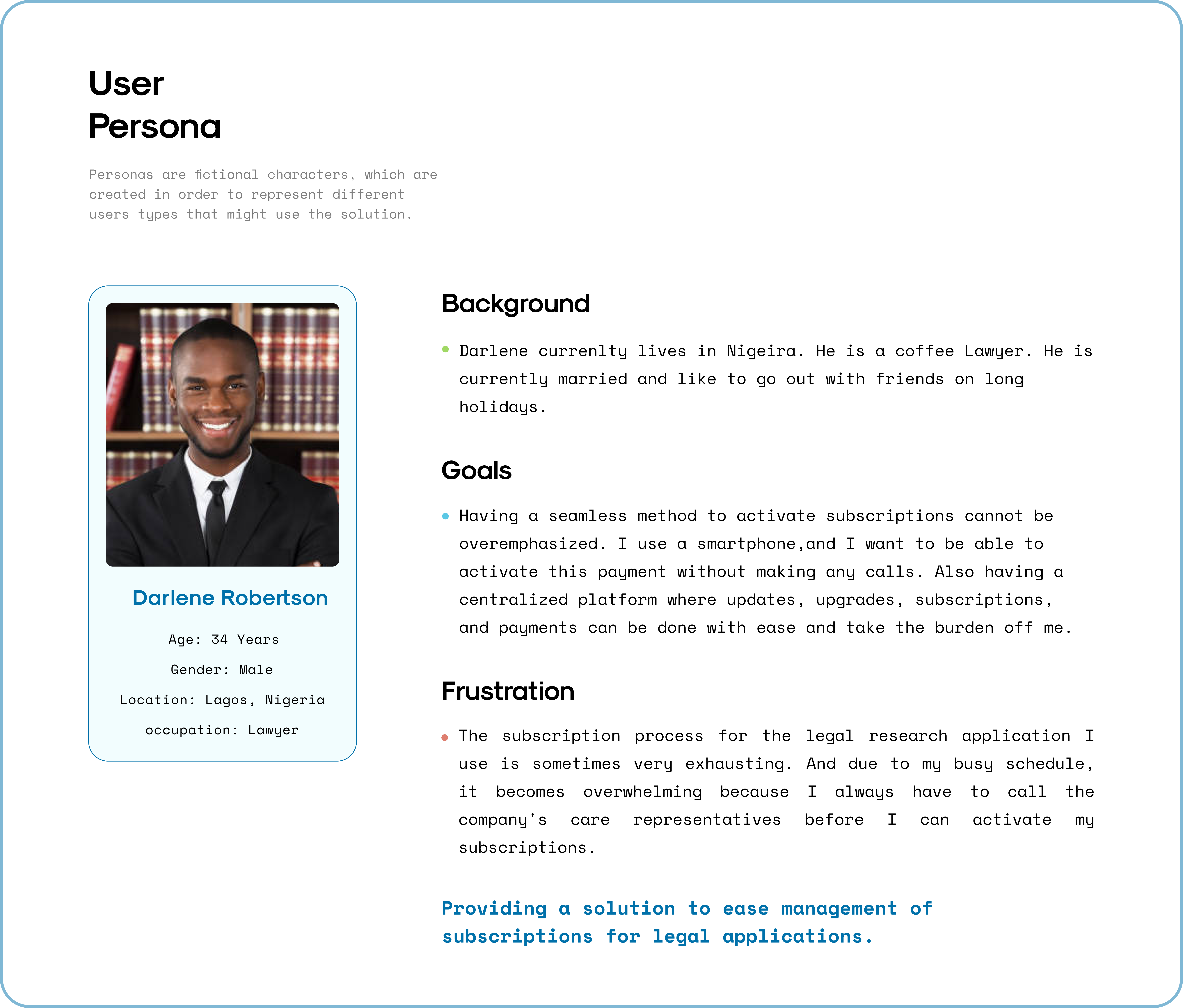
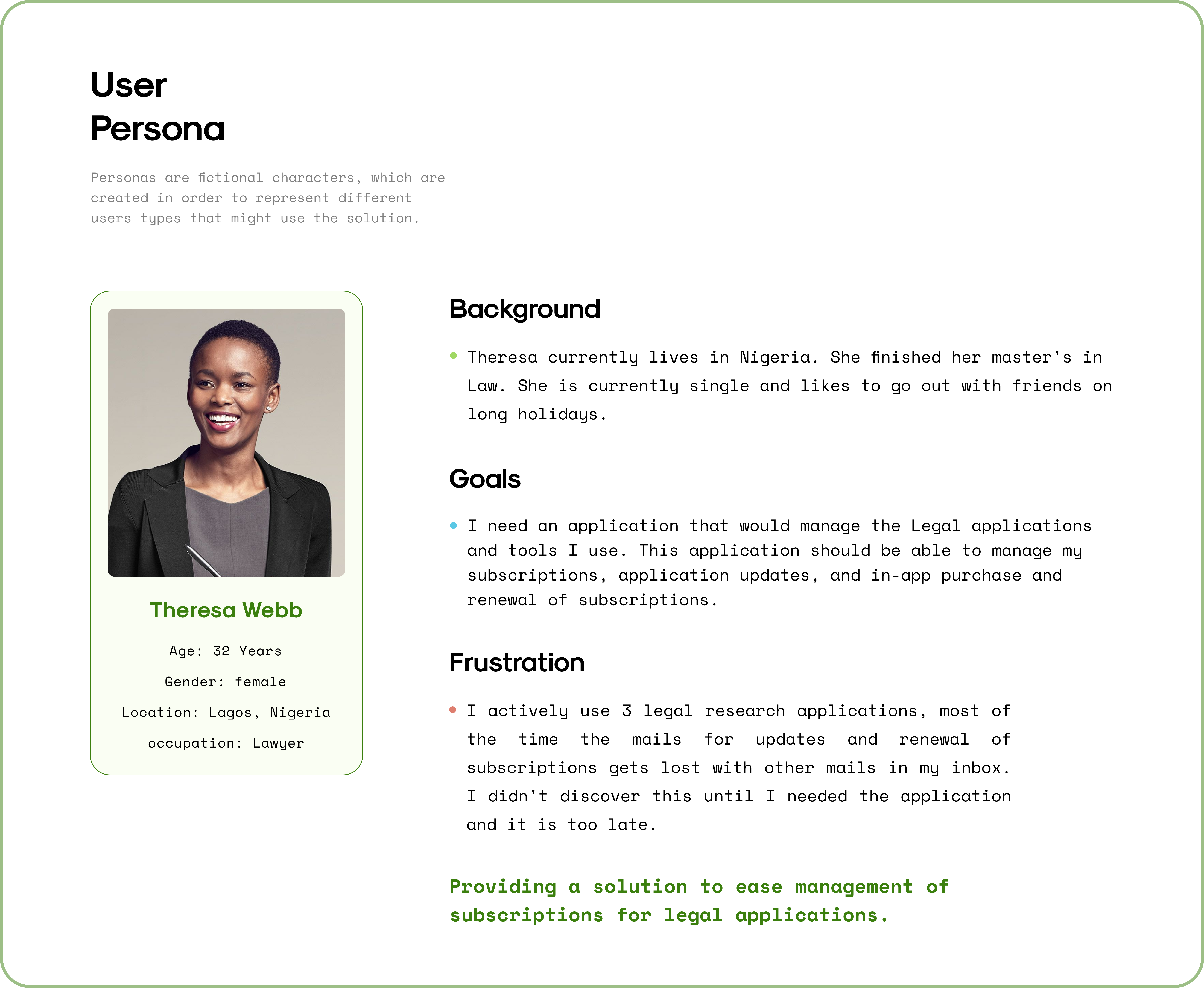
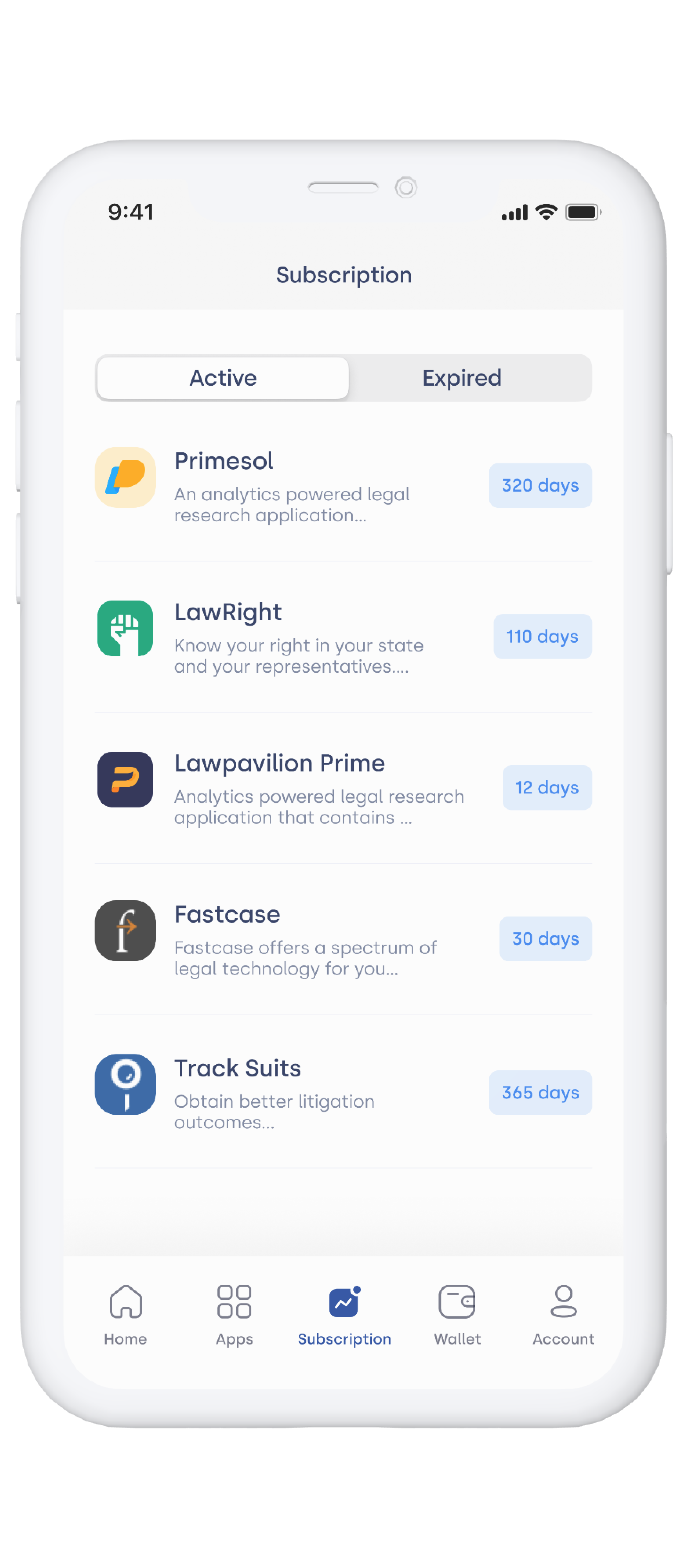
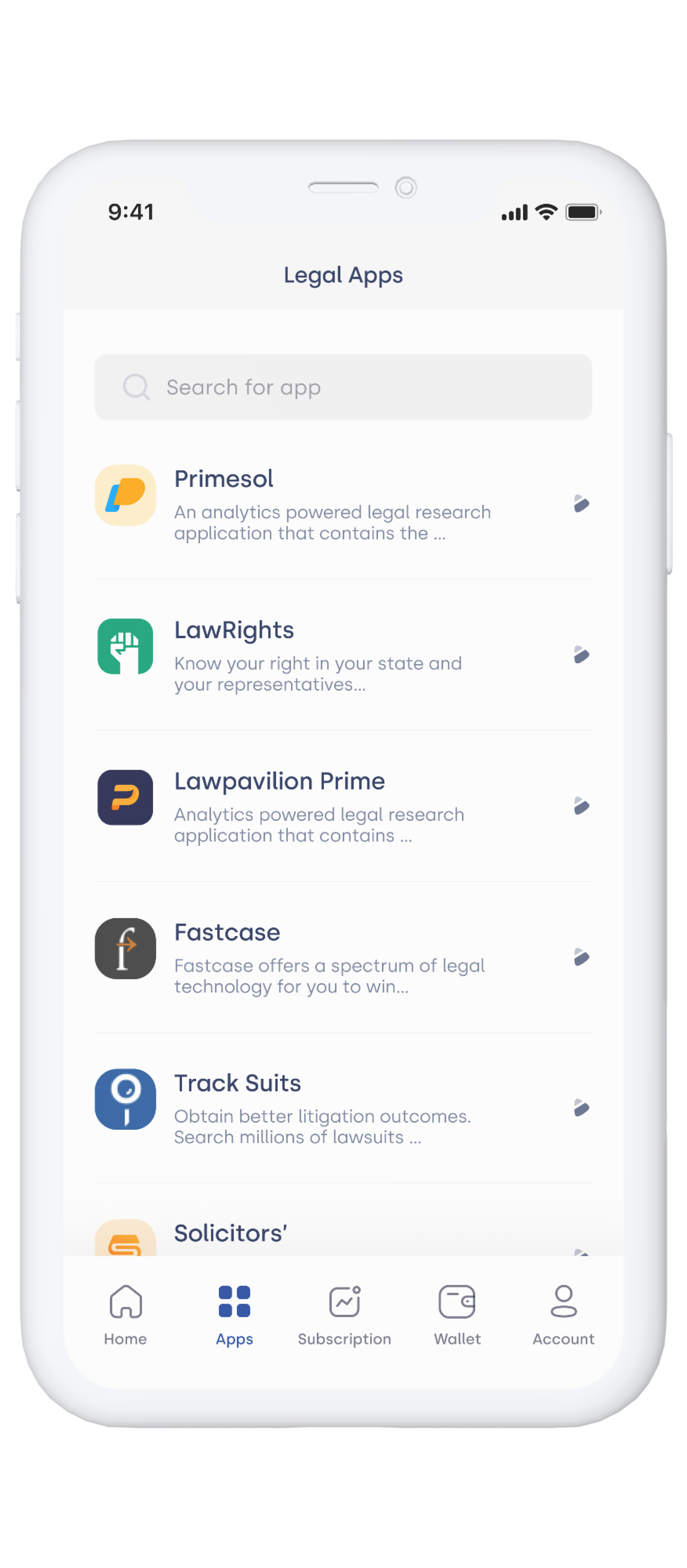
Legal work depends on tools. Practitioners routinely rely on LexisNexis for case law, Westlaw for legislation, Practical Law for precedents, and several others, each serving a specific function, none integrated with the others. In most firms these subscriptions are purchased individually, managed independently, and renewed manually.

The problem this creates is not that practitioners lack access. It is that they have no reliable way to know the status of what they depend on. A subscription that expires mid-matter interrupts active client work, requires emergency renewal, and in some cases affects the quality of advice delivered under time pressure. The tools are mission-critical. The infrastructure around them is not.

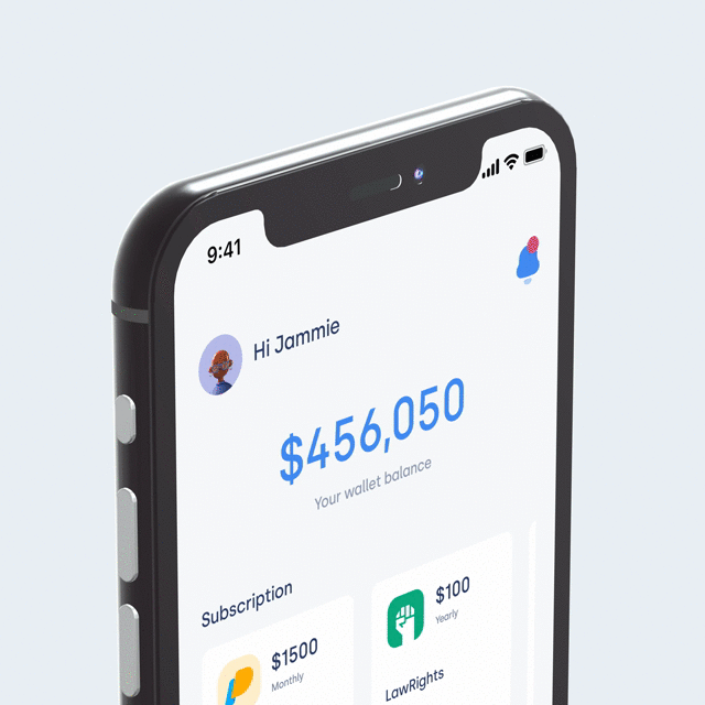
Research, across interviews with practising lawyers and paralegals, collaborative workshops, and persona synthesis, surfaced a consistent picture. Practitioners were managing between three and six subscription-based tools simultaneously with no single place to track them. Each billed separately, renewed on its own cycle, on timelines nobody had clear visibility into. In practice, most found out a subscription had lapsed when they tried to open a tool and couldn't. Several described paying rushed reinstatement fees after losing access mid-matter, a problem that felt administrative until it became a professional one.

What appeared to be a simple tracking issue revealed a deeper problem: subscription management was not integrated into the workflow of legal practice.

Personas

Two profiles. Two failure modes.

Darlene and Theresa represent the two distinct failure modes the research surfaced. Darlene's problem was process: renewal required calling company representatives before anything could be activated, a step that became impossible to maintain under a full caseload. Theresa's problem was visibility: renewal emails for three separate tools were getting buried in her inbox, and she only discovered a lapse when she tried to open a tool and couldn't. Different surface behaviour, one active and one passive, but the same underlying gap. Neither had a reliable way to know the state of what they depended on. Both profiles stayed in frame throughout every design decision that followed.

Darlene Robertson, practising lawyer based in Lagos

Darlene Robertson

34 · Lawyer · Lagos, Nigeria

Goal

A seamless way to activate and manage subscriptions without calling company representatives, a centralised platform where updates, renewals, and payments happen in one place.

Frustration

The activation process requires calling representatives every time. Under a full schedule that becomes impossible to sustain, so subscriptions lapse before she has a chance to act.

Theresa Webb, paralegal coordinating multiple subscription tools

Theresa Webb

32 · Lawyer · Lagos, Nigeria

Goal

A single place to manage all legal applications, subscription status, updates, and renewals visible without hunting through email or navigating multiple billing portals.

Frustration

Renewal emails for three tools get buried. She discovers a subscription has lapsed only when she tries to open the tool, at which point it is already too late.

Insights

Not a notification problem. A structure problem.

The initial assumption, in the brief and in the first pass of the research, was that this was a notification problem. Remind practitioners earlier, more reliably, harder to dismiss. The research dismantled that: practitioners were not forgetting. They were working in an environment where subscription state simply had no home. A reminder fires once and disappears. What was needed was somewhere subscription status was always visible, part of the daily view without requiring anyone to go looking for it.

The notification model assumes the problem is timing, that practitioners fail because alerts don't reach them at the right moment. But even practitioners who received renewal emails often didn't act on them promptly: acting required context-switching, locating payment details, and navigating an external billing portal. The cost of acting was high regardless of when the reminder arrived. Reducing that cost meant removing the friction entirely, not building a better alert, but making subscription status a permanent part of the environment practitioners already worked in.

System

Three elements. One organising layer.

That constraint, making subscription state a permanent part of the environment, not an alert that fires and disappears, required a structural model, not a new notification layer.

Rather than treating applications, subscriptions, and payments as separate features, subscriptions were placed at the centre, connecting the tools practitioners use and the payments that fund them. Everything in the product is a view of, or an action on, that relationship.

Two other models were considered. Applications at the centre would have made this an app catalogue, good for discovery, wrong for lifecycle management. Payments at the centre would have made it a billing tool, useful for finance, but disconnected from the tools generating the costs. Subscriptions at the centre was the only model that kept both relationships visible in one place: what a practitioner depends on, and what maintaining that dependency costs.

01 Applications

The legal tools practitioners depend on. Each application maps to one or more active subscriptions.

02 Subscriptions

The central organising layer. Connects tools to their financial and lifecycle state.

03 Payments

Cards and wallet balance. Payment flexibility is introduced through card management and in-app funding.

System architecture diagram
Wireframes

Two changes. One pattern.

Two things changed significantly between the wireframes and the final design. The subscription list started as a single flat list sorted alphabetically, wireframe testing showed practitioners scanning for expired items in the wrong places, which led to the Active / Expired tab split. The wallet was originally buried two levels deep in a payments screen; practitioners missed it entirely in early walkthroughs, which surfaced the decision to promote it to the home dashboard.

Both changes pointed to the same underlying thing: practitioners organise their thinking around subscription status, active or expired, not around tool names or billing dates. The information architecture had to follow that, not fight it.

Open in Figma ↗
Design Decisions

Where the easier path was wrong

The wireframe changes pointed at something about how practitioners think. Each of these decisions was shaped by the same constraint.

Mobile-only, not a dashboard

An early framing positioned this as a browser-based admin dashboard. Research challenged it: practitioners access tools and check statuses on their phones, often between matters. A dashboard would have required a different context and a different habit to form. Mobile surfaced the product where the behaviour already existed.

Wallet over external payment

Routing renewals to an external payment provider would have been the faster build. The wallet model was more complex to design, funding, card management, balance tracking, but it placed the financial relationship inside the product rather than handing it off. That kept renewal a single unbroken flow rather than a redirect.

Renewal as continuation, not a transaction

The renewal flow could have been a billing event, navigate to billing, confirm payment, done. Instead it was treated as extending something already in use. The countdown ring surfaces urgency without requiring navigation; tapping it enters the renewal flow directly. Plan selection and payment complete on the same screen. The decision was to make renewal feel like a continuation, not a new financial process to initiate.

Final Screens

Where the system became an interface

Reflection

What I would do differently

The most significant shift in this project happened early, when the framing moved from "how do we remind practitioners about renewals" to "how do we give practitioners a structural view of their subscriptions." That reframe was the project's most productive moment. Getting to it earlier would have compressed the research phase without losing what mattered.

The wallet interaction model is the area I would revisit. The current design keeps funding and card management in a single screen, which is clean, but the prioritisation between the two actions is unresolved. In testing it read as equally weighted when they are not: funding is frequent, card management is occasional. A second round of iteration on that screen would have surfaced a clearer hierarchy.

The system model, subscriptions as the organising layer connecting applications and payments, held throughout every phase without needing revision. That is unusual. It is also what makes the product feel coherent rather than assembled. If this were to go further, the model scales naturally: team-level subscription views, budget reporting, firm-wide licence management. The structure is already there.

Previous project Command Palette All projects Selected projects