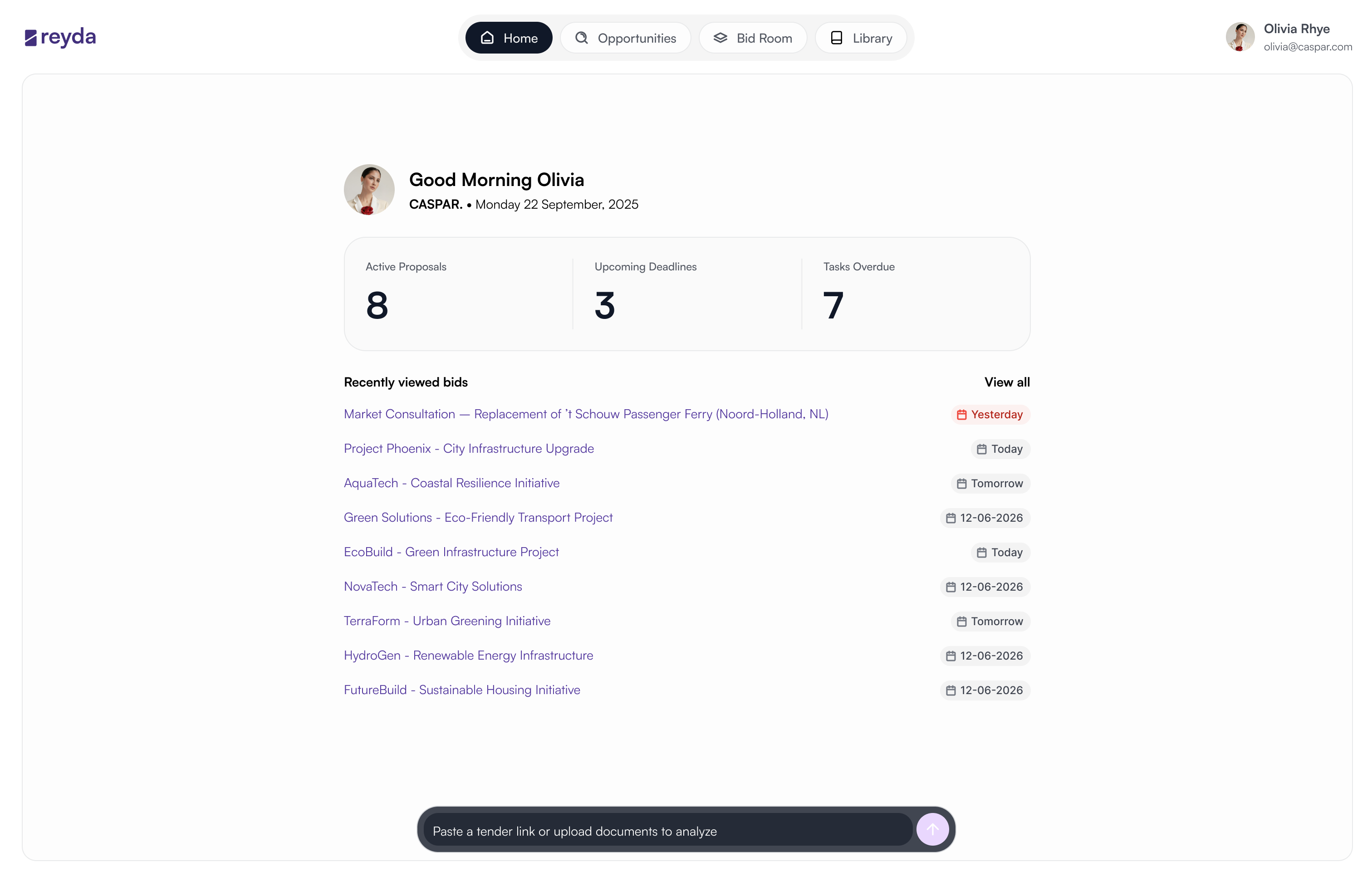
At a glance
It became the most-used way to make a task in Superlist.
Within weeks of launch, Quick Command overtook the sidebar and the list views as the way tasks were created. People stopped navigating to a place to make something, and started saying what they wanted.
01 · The problem
Tasks were being created. They just weren’t going anywhere.
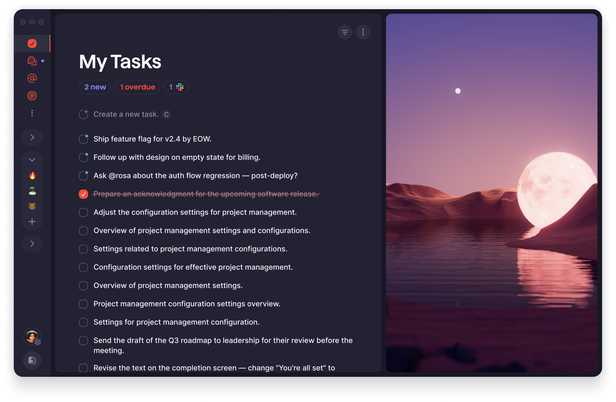
The first signal was in the product data. Inside My Tasks, Superlist’s catch-all view, a backlog of captured tasks kept growing that nobody touched again. Not completed, not moved. It failed in two ways:
- 01Capture missed the moment. The thought came up mid-meeting and had gone by the time they were back in Superlist.
- 02Capture landed nowhere. The larger group: the task existed, with no destination, no owner and no context.
02 · Research · What we saw
First I watched. Six patterns kept coming up.
Before asking anyone anything, I went passive: usage data and session recordings, looking for where things broke without anyone flagging it. Capture was happening; commitment wasn’t.
02 · Research · What we asked
Then I asked. 16 sessions with beta power users.
With the embedded researcher, I ran 16 structured sessions with people who used Superlist often enough to have formed habits around it. We split them into two groups on purpose, because the difference mattered:
- 01Personal organisers. Freelancers and individuals running their own work. A capture problem: get the thought down before it degrades.
- 02Team leads. Assigning and tracking work for others. Capture plus coordination: the task had to reach the right person, ready to act on, because someone else’s work depended on it.
The finding that changed the brief
People weren’t avoiding Superlist. They’d built a ritual around it.
They wrote the thought somewhere else first, Slack, Notes, a voice memo, and entered it properly later. By then the context had decayed, and old tasks no longer said why they mattered.
The app had set a standard of completeness people felt they had to meet before they showed up. Superlist was treating itself as a place for finished work, not raw capture. That rewrote the problem.
03 · The reframe
Not a faster form. No form at all.
The brief asked me to surface incomplete tasks and speed up creation: a completion problem. The research showed a structural one, so I reset the question:
How might we let people capture from anywhere, with enough context to act on,
without making it proper first?
The research made the case: every insight pointed to the same gap. The reframe earned executive buy-in quickly, and the conversation moved from whether to build it to how far the pattern could reach.
04 · Information architecture
Everything people tried to do fell into three intents.
I clustered what people told us they were trying to do across the sessions. Almost every intent was one of three, so the architecture became one layer with three verbs, reachable from any context: ⌘K on desktop, a dedicated button on mobile.
- 01Create. A task with its list, owner and due date, in one motion.
- 02Search. Find, update and add context to anything without leaving the current view.
- 03Go anywhere. Jump straight to any list, project or view, without knowing where it lives.
Three rules
Every interaction had to pass all three.
- 01Decide in context, not later. Where a task goes and who owns it are set as it is created. Deferring organisation is how context disappears.
- 02Use conventions people already know. A new mental model costs too much for a capture tool. It had to feel familiar from the first use.
- 03End with the task in the right place. A task that doesn’t land correctly isn’t captured at all.
05 · The experience
Capture from anywhere, the moment the thought arrives.
Intent surfaces in meetings, browsers and conversations, outside Superlist. Quick Command opens over whatever is on screen, so capture happens at the moment of the thought, not after a switch back into the app.
05 · The experience
Where it goes, who owns it and when, in the same motion.
Tasks landing in My Tasks with no destination were the root of the duplicates. Here the list, the assignee and the due date are set alongside the task name, so there is nothing to tidy up later.
05 · The experience
Shortcuts that teach what it can do, as you use it.
Quick Command can do more than most people expect the first time they open it. The challenge was making that depth discoverable without documentation. Shorthand, @ and # and natural-language dates, surfaces each capability at the moment it’s relevant, so people learn it by using it.
05 · The experience
Finding and creating are the same gesture.
People expected retrieval to be instant; remembering where something was stored felt like the wrong problem to solve. Search lives in the same layer as creation, so navigation becomes intent, not location.
06 · Testing · Problem 1
Then we started testing, and found some problems.
The biggest was the first version’s guessing. Type “Buy milk for Bronte on Tuesday” and it inferred the owner and the date.
It felt magical when it worked. In practice, tasks often went to the wrong person, silently, so people had to check every result, which cancelled out the speed.
06 · Testing · Fix 1
So assigning became explicit. @ for a person, # for a label.
Inference gave way to triggers people already knew from other tools. A deliberate trade: less appearance of intelligence, more predictability and control. What you type is exactly what gets created.
06 · Testing · Problem 2
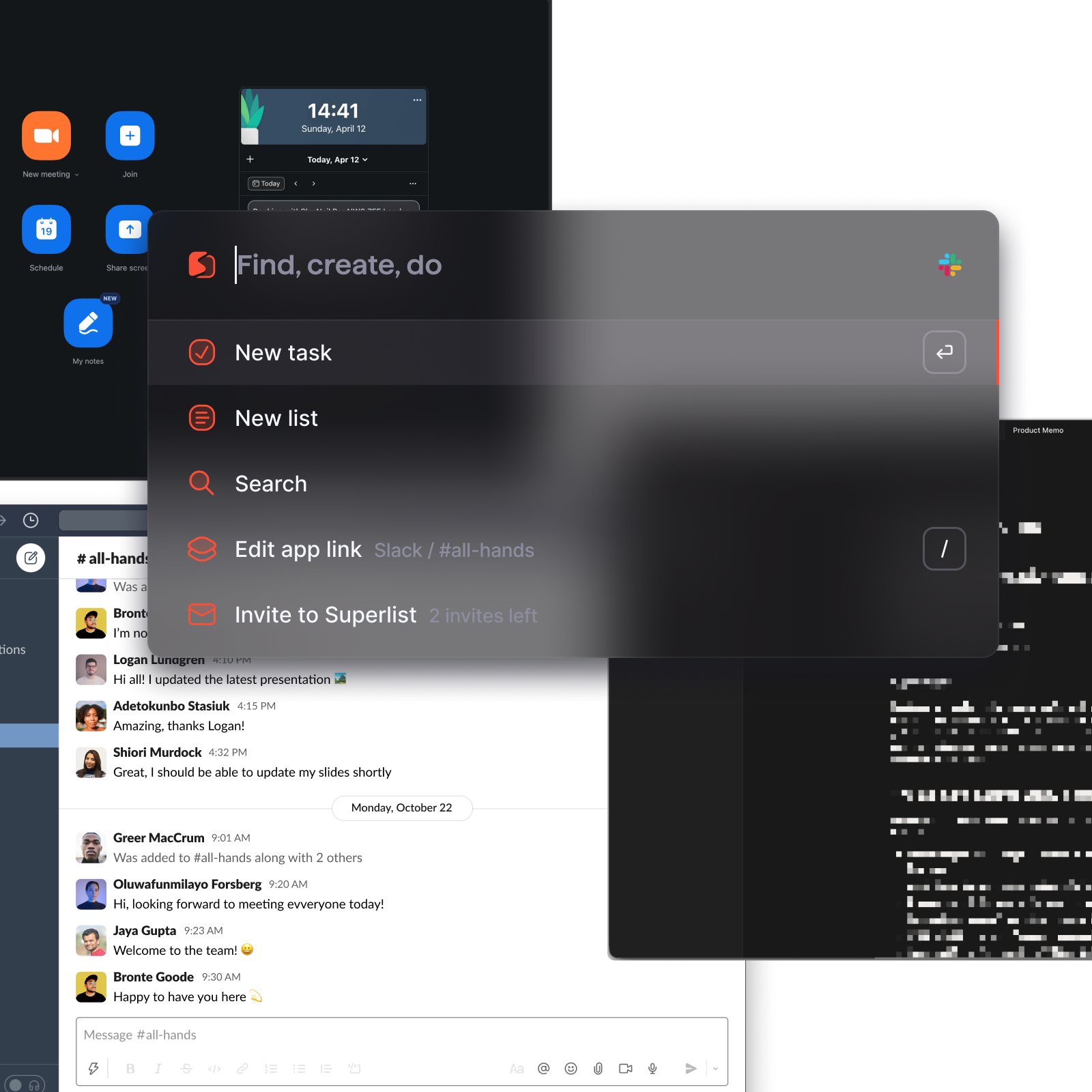
The glass looked premium, and failed over busy screens.
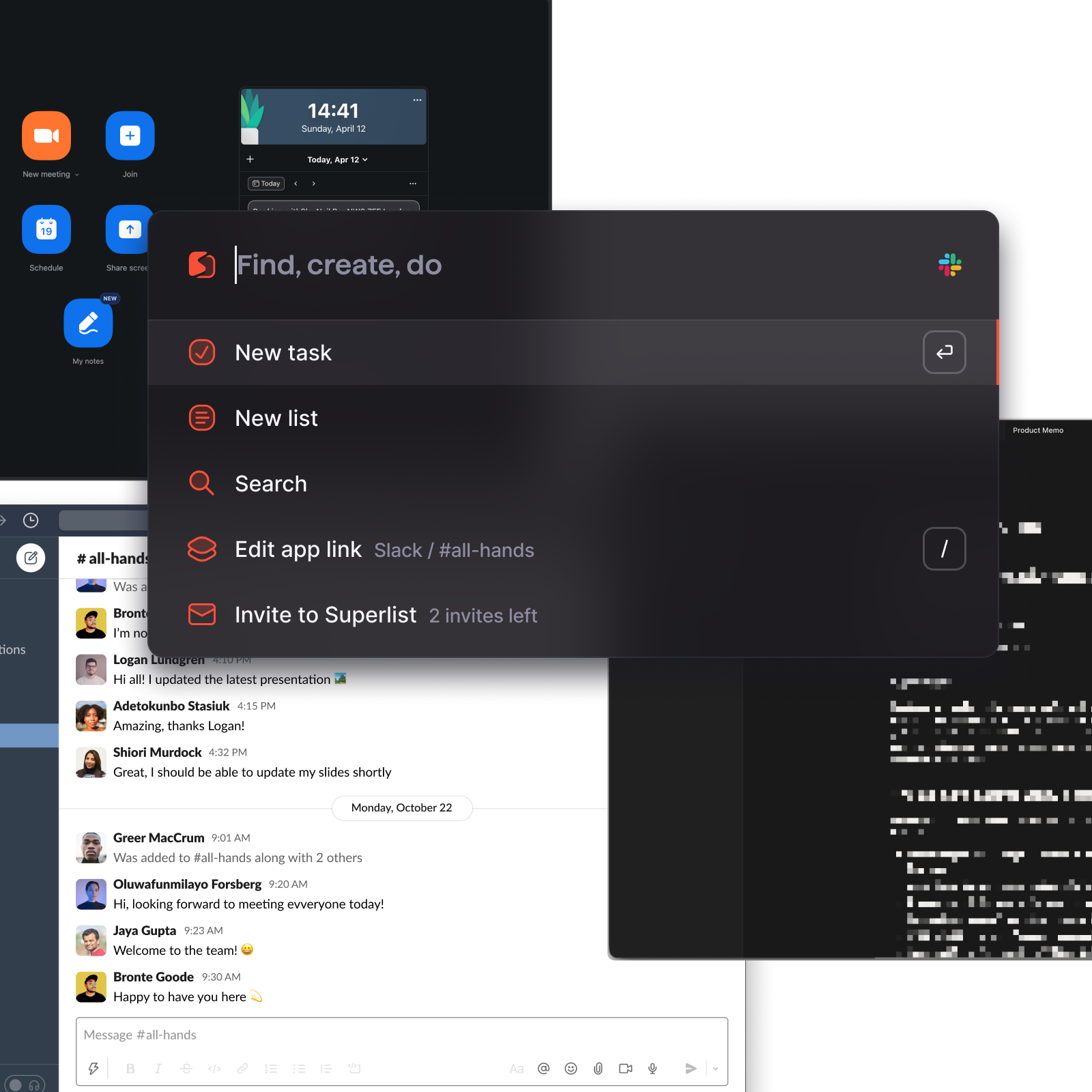
The first surface leaned hard into glass: heavy blur, low fill, near-transparent edges. Floating over whatever was on screen, its text fell below AA contrast.
The fix kept the blur and the soft edges, and raised the fill and the contrast. It still reads as glass, and the words hold on any background. Drag the line to compare.
06 · Testing · Three smaller fixes
The same rounds sharpened three smaller things.
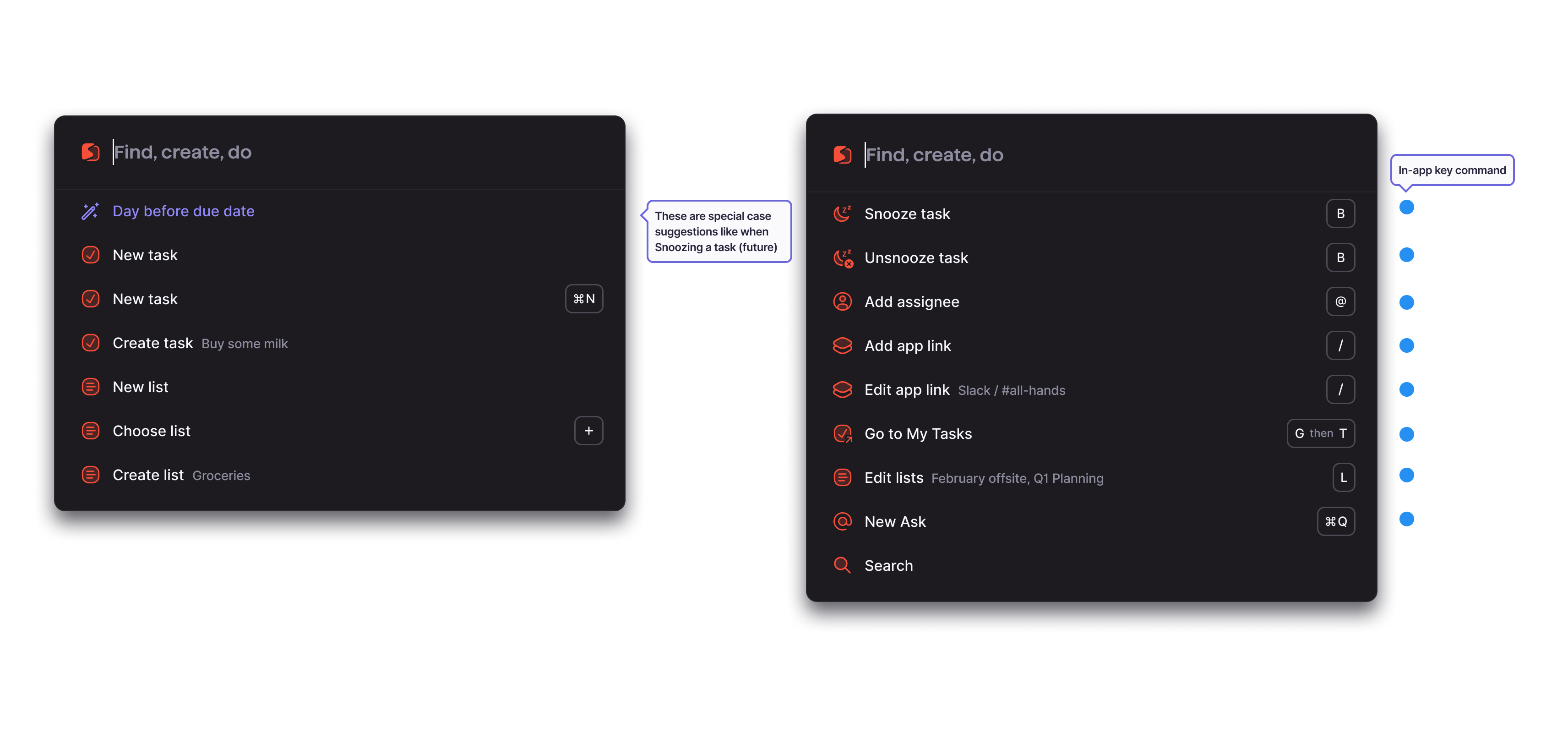
- 01Most-used commands first. The top level was unclear, so it was reordered around what people actually ran.
- 02Suggestions in context. Suggestions didn’t always match intent, so recent and contextual results now come before global ones.
- 03A clear landing. People weren’t sure where a task went, so every one now ends with its destination and a confirmation.
The prototype
The shipped version. Press ⌘K and try it.
A working recreation of Quick Command after testing. Type a task, assign it with @, label it with #, give it a date in plain words, search and jump to a list, or switch to another app and capture from there. The snackbar tells you where each task landed.
07 · Where it led
Its first adopters weren’t power users.
Quick Command was scoped as an accelerator for people who already knew Superlist well. The first group to reach 43% adoption used Superlist mostly as a list. It gave them a simpler relationship with the product: they no longer needed to know where anything lived.
07 · Impact
A new centre of gravity within the product.
Within weeks, about 40% of all new tasks flowed through it. Navigation events dropped 15% per session, and capture to commit landed under 4 seconds: fast enough that intent and action read as one motion.
The mental model moved from “go to the right place” to “say what you want and go”. The command layer stopped being a shortcut and became the main way people related to Superlist, and it shaped what its default surface should be.
Reflection
What designing for intent taught me.
- 01Change the question, not the flow. The brief asked for a faster form. The research showed the product’s own edge was the barrier: thoughts arrive outside it. Reframing the work as a layer that meets intent wherever it starts is what earned buy-in, and what moved 40% of task creation.
- 02Build for the floor, and the ceiling follows. It was scoped for power users, yet people who used Superlist as a list adopted it first. The drop in navigation wasn’t a usability win; it showed a new mental model, “say what you want and go”, and that reshaped what the product’s default surface should be.
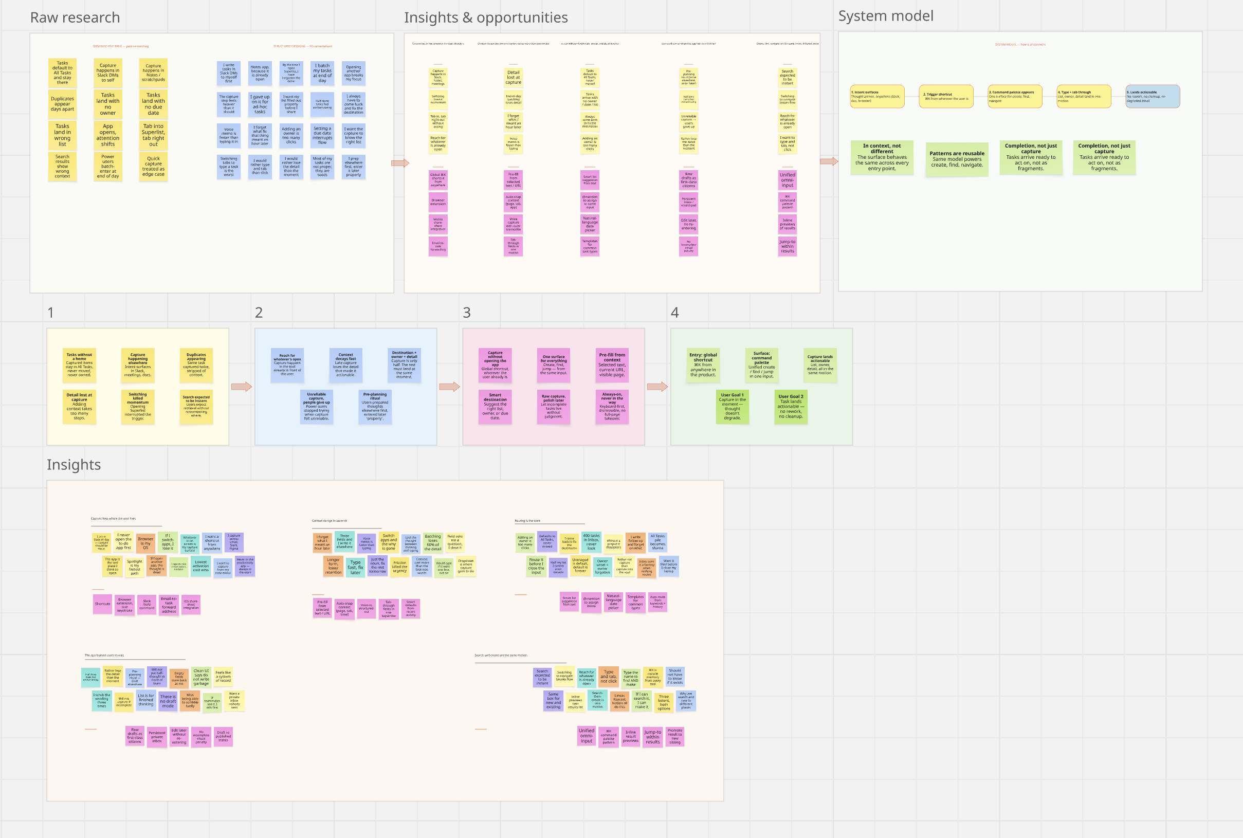
From the Figma board: the six patterns that came up
What the sessions showed
the wrong Bronte, and nobody noticed
People
you choose; it never guesses
heavy blur, looked premium
the text: very faint
same glass, stronger fill
more accessible: text holds AA
01 · Most-used commands first
 Find, create, do
what people actually run, first
02 · Suggestions in context
Bring extra whiteboard pensSuggested for February offsite
recent and nearby, before global
03 · A clear landing · the snackbar
it tells you exactly where it landed