Senior Product Designer · 2024 to present · Oracle
Governments already had the data they needed to monitor food security. What they did not have was a way to bring it together fast enough to act on it. I designed the intelligence system that does, now running in Rwanda, Kenya, and the Philippines.
Key insights
The problem
Every one of those numbers is measured, published and kept up to date. What no government had was a way to turn them into a decision inside the season they describe.
Figures from FAO, IFAD, UNICEF, WFP and WHO, The State of Food Security and Nutrition in the World 2025.
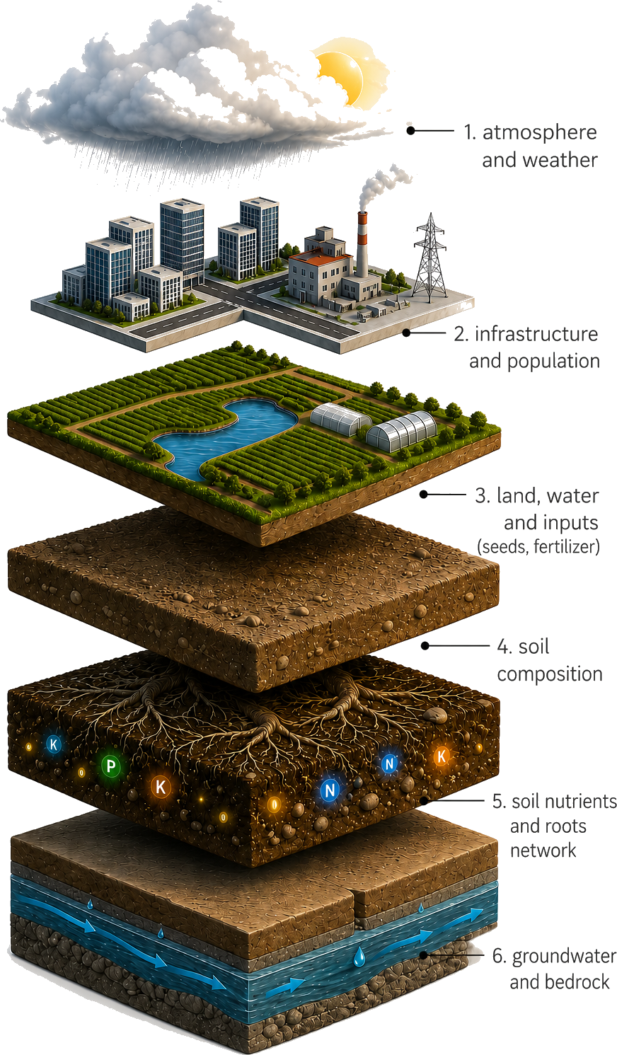
The problem · Every layer, already measured
Food security is the outcome of many conditions: crop production, weather, soil, water, inputs, crop health, infrastructure, and consumption. Every one of them was already being tracked by somebody, separately, by different teams, on different timescales.
For an official, building a reliable picture meant requesting data from ministries and regional offices, waiting weeks for replies, reconciling formats that did not match, and assembling the result by hand. By the time the picture was ready it was already old. The challenge was never access to more data. It was making the data that existed interpretable, trustworthy, and actionable.
What the research showed · User goals
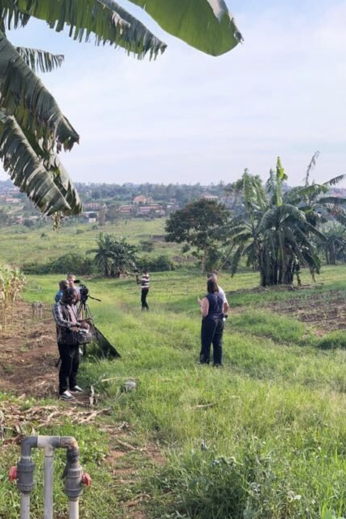
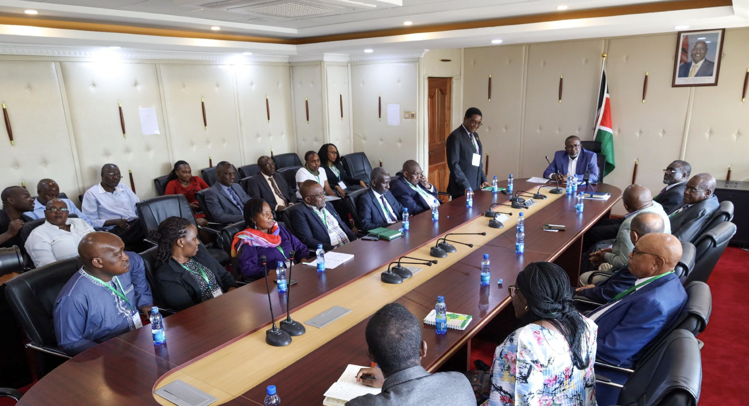
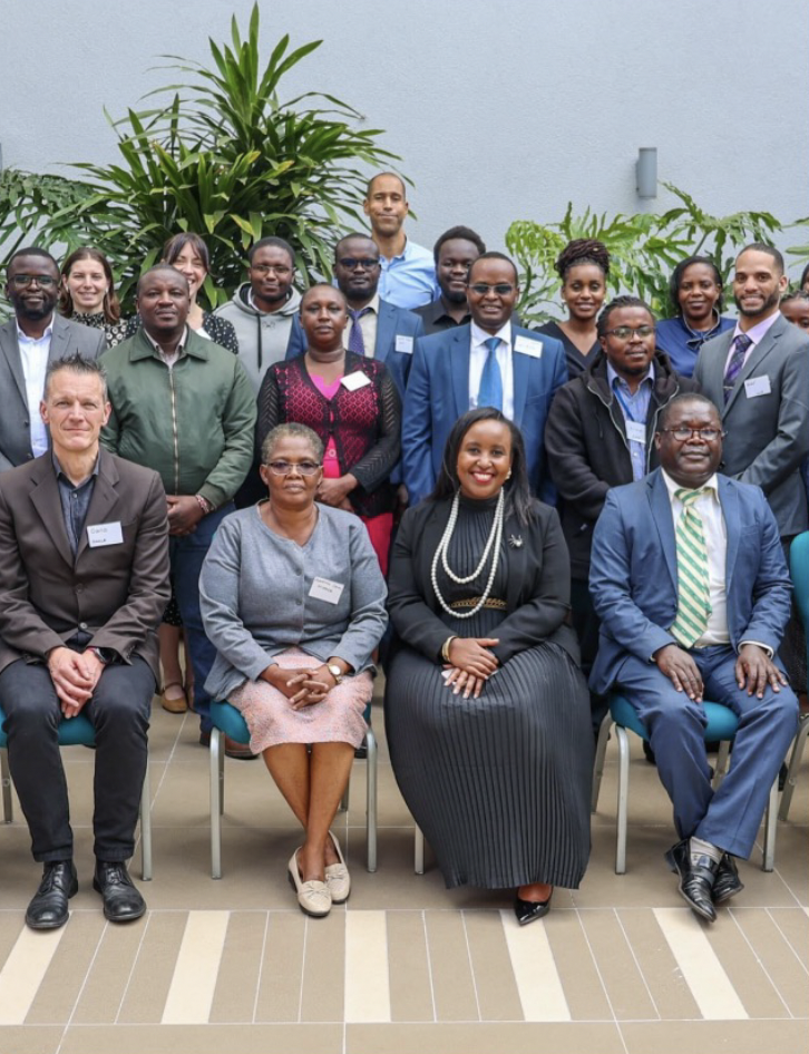
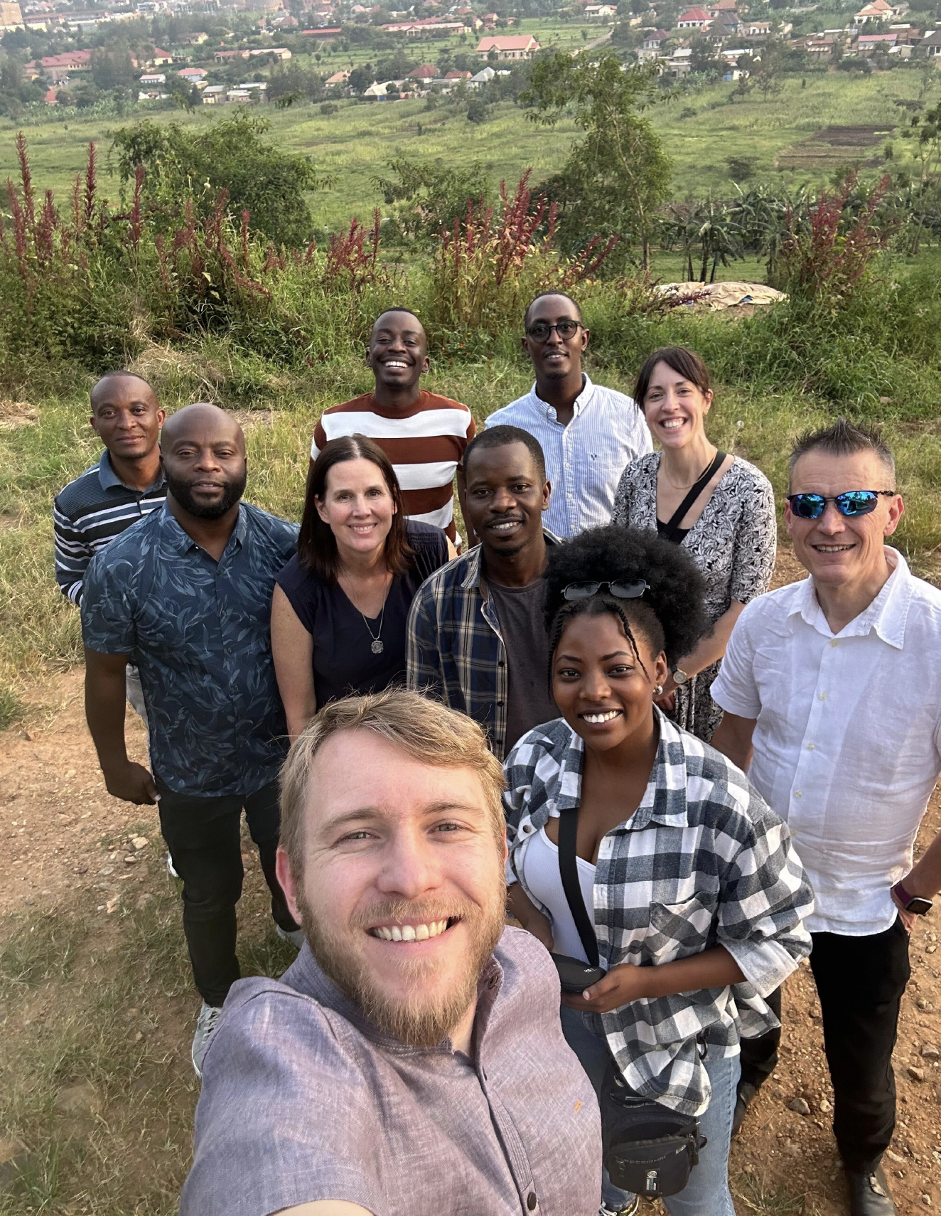
I spent the first stretch of the project in the field: research sessions and interviews with ministry officials, district agronomists, and policy advisors across Rwanda, Kenya, the Philippines, and Albania. Four very different agricultural economies, and what they were actually trying to do came back as the same three goals every time.


As an advisor, I need to identify emerging agricultural risks, assess impact, and determine the best course of action, so that I can provide timely, evidence-backed recommendations to decision-makers.
As a user in the ministry of Agriculture, I need a clear, actionable picture of the food system’s status and intervention options, so that I can inform and advise all relevant stakeholders and decision makers regularly.
As a user in the agricultural ministry, I need to track short and long term effectiveness of the actions taken, so that I can adjust the strategy if needed, have benefits outweigh costs and learn on the best course of action long term.
Those three became the architecture of the product. Every surface I designed answers to one of them, and the system is only as good as the decision it lets someone make that week.
01 · Monitor
Insights surfaces emerging problems on its own, instead of waiting for someone to go looking. Every drought, price shock and pest outbreak arrives in one list, ranked by severity and urgency against the national food security goal, each carrying what is happening, why, what happens next, and what we can do. An advisor sees a risk forming, reads its impact across the season, and takes the evidence into the room.
02 · Understand
The Visual Explorer brings agricultural and environmental signals into one spatial view. Land cover, rainfall, soil moisture and crop condition become contexts you switch between on the same map rather than separate reports, and you move from the national picture down to a single field without changing tools. A minister, a regional officer and an extension worker all read the same data, at the resolution their work needs.
03 · Respond
Projects is where a decision becomes work someone owns. A response chosen in Insights turns into a project with an owner, a budget and a deadline, measured against the exact indicators that raised the alarm, so its effect can be seen rather than assumed. Over seasons it becomes the institutional record of what was tried and what happened afterwards, and that record outlasts whoever was in post.
What changed
The chain is the point. An official opens the country and sees where the crop is at risk. The system says which of those to act on first and why. The response becomes a project with a budget, an owner and the indicators it will be judged against. And at the end of it, seed, fertiliser or water reaches a farm in a district someone can name. That is the distance the product closes, inside the window where acting still changes the season.
It is live in Rwanda, Kenya, and the Philippines, countries with a combined population of more than 185 million.
What changed · The launch
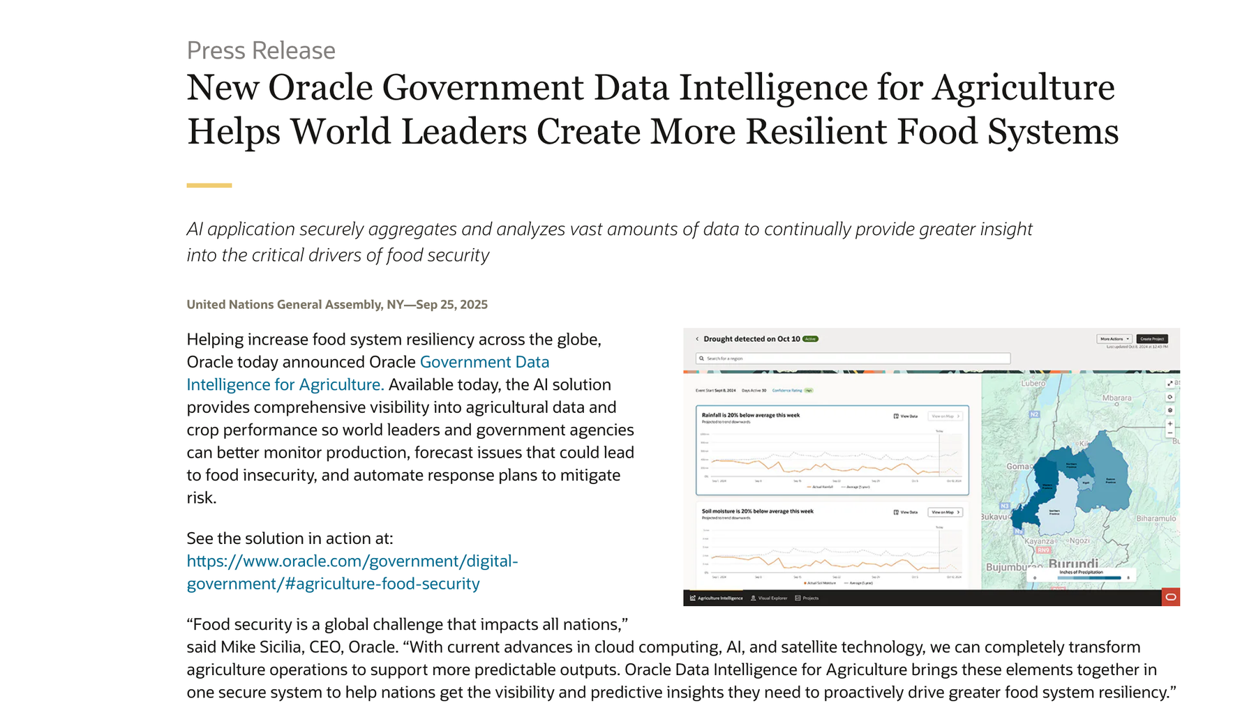
Oracle announced Government Data Intelligence for Agriculture from New York on 25 September 2025. Oracle’s CEO is quoted in the opening; Rwanda’s Minister of ICT and Innovation further down the release.
The launch announcement, United Nations General Assembly, 25 September 2025.
Reflection
The hardest part of this work was not the interface. It was the structure underneath it: how indicators, goals, events, insights, responses, and projects relate to each other, so the product can grow without losing its logic. When AI, scenario planning, and ground-truth collection arrived, nothing had to be redesigned.
The principle that made it hold is simple. Design for the workflow, not the screen. UI changes when teams change; workflow rarely does. That shifted my role from designing individual experiences to designing the system that connects them.
Where it stands
Everything in these slides is the MVP: the first version governments could actually run, and the one Oracle announced from New York. It has not stopped moving since. AI, scenario planning and ground-truth collection all arrived after that first release, and the entity model underneath took each of them without a redesign. That was the point of building it that way.
This deck is a summary, and a lot of the work is not in it: the research sessions, the entity model, the iterations that did not survive. If any part of it is worth more detail, reach out and I will walk you through it.