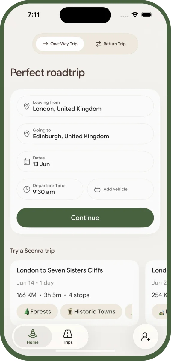
01
Trip details
One-way or return. Departure, destination, date, and time.
Google Maps optimises for speed. Scenra optimises for what's worth seeing between A and B — an AI-native scenic road-trip planner for iOS.
Download on theApp Store2:24 median from install to a finished trip
A creative tool that hands you a complete, verified drive inside 150 seconds of a cold install.
72% of installs complete onboarding
No tutorial, no account required before the first result.
37% go on to generate a trip
More than a third of cold installs reach a produced artefact — the bar the design was aimed at.
#1 in the UK App Store
For "scenic road trip", after rebuilding the listing on measured competition.
We drove London to the Lake District and couldn't plan a scenic route with any tool we tried: Claude, Gemini, and ChatGPT gave partial answers, and Maps couldn't hold a plan. Nothing stitched AI knowledge to real coordinates, hours, and fuel stops — so we built the loop ourselves.
Last week of December 2025, we drove from London up to the Lake District — friends, and Nala the dog. The drive itself was the point. We wanted scenic, not motorway-fastest: where to stop and when, where to refuel, where to grab a coffee, which areas were dog-friendly, where Nala could pop out for a break. We wanted to know what was worth seeing between A and B.
We tried to plan it with the tools you'd reach for in 2025: Claude, Gemini, ChatGPT. Each gave a partial, plausible answer. None gave a complete plan. We went back and forth across three chat windows, sent screenshots into the group chat, jumped out to Google Maps to check what places actually looked like and how close they sat, then back to the chats to refine. The output was a fragmented list, not a route.
The friction wasn't AI being bad at travel. It was that no surface stitched the AI's knowledge to real coordinates, real photos, real opening hours, real distances, real ferry crossings, real fuel stops — and back to the AI when we wanted to swap something. Every product we touched did one of those things well. None of them did the loop.
By the time we were back, the decision had made itself: build the loop ourselves. The problem wasn't worth waiting for someone else to solve, and we'd just spent a weekend specifying the requirements as customers.
One living document, SCENRA_PRD.md, is the source of truth any Claude session can read and ship against. Fourteen RW-prefixed primitives build every screen; we direct product and architecture while Claude Code implements, and corrections are written back into the PRD so sessions compound.
The build is as much of the story as any screen. Moyin leads the engineering with Claude Code as a genuine partner — not a code completer — while product and design decisions take shape between us. Three things hold it together: the documentation, the design system, and the working pattern with Claude.
Every feature, decision, bug, and ID routes through SCENRA_PRD.md — 366 KB, treated as authoritative. Backlog rows mirror to memory caches for Claude session continuity, and the interactive Kanban board regenerates from the PRD, never the other way around. Conflicts always resolve in the PRD's favour.
Why it matters at this scale: documentation isn't ceremony, it's how Claude sessions stay consistent across days, branches, and contexts. A new session, in a new chat, with zero memory of yesterday's work, can read the PRD and the playbook and ship correctly. The PRD is the org chart.
SCENRA_PRD.md
Single source of truth. Every implementation, decision, backlog row, changelog entry.
PROJECT_SYNC.md
Playbook for any Claude session. Ship-implementation, decision-capture, backlog-add recipes.
BACKLOG_SYNC.md
The four-way sync between PRD, memory caches, the HTML board, and browser localStorage.
backlog_board.html
Interactive Kanban, regenerated from the PRD. Drag-drop state lives in localStorage.
Fourteen reusable components, all RW-prefixed: buttons, cards, chips, text fields, step indicators, floating sheets, a segmented control, shimmer, a looping video player, tight-line-height text, word-reveal text for onboarding. Every screen is built from these. If a new pattern is needed, it earns a primitive first.
Tokens live in one theme file: cream background, dark brown text, olive-green CTA, off-white cards, with Google Sans Flex as a variable font tuned for roundness. Six nature-type colour pairs — sky, sage, coral, lavender, sand, amber — keep the scenery badges distinct without breaking the warm palette.
Vibe-coding stories in 2026 all read the same: "I built this with AI." The specifics are the whole point. We direct the architecture; the AI fills the implementation. When it suggests something we disagree with — a different state model, a wrong abstraction, feature creep — we override and write the spec correction back into the PRD, so the next session inherits the corrected understanding. The AI compounds across sessions because the documentation does.
Two input screens and a review step. The AI plans the route, verifies every stop against Google Places, and reveals a timeline with per-leg drive times.
Two screens of input cover trip details and scenery preferences. A review step lets you tweak anything before tapping Generate. Behind the scenes: AI route plan, Google Places verification on every stop, polyline routing, per-leg drive times — all surfaced as a progressively revealed timeline.
One-way or return. Departure, destination, date, and time.
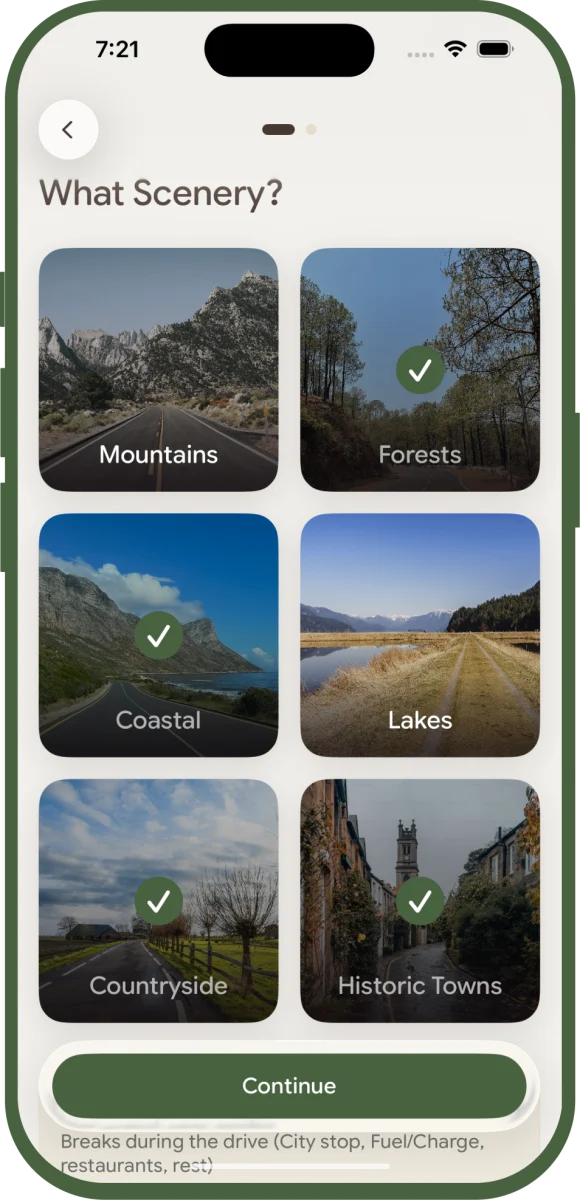
Scenery, number of stops, and service stops on the route.
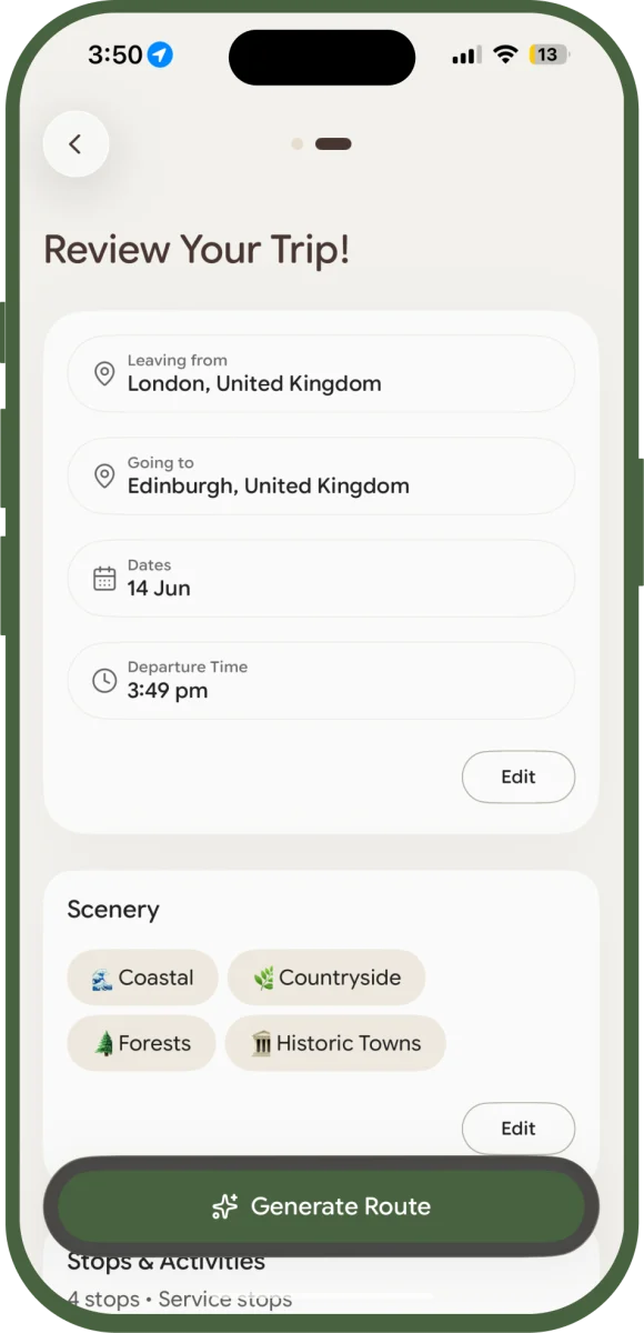
Confirm or tweak any input before tapping Generate.
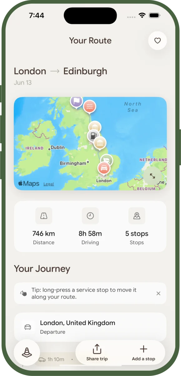
The AI plans the route and reveals it on the map with total distance and drive time.
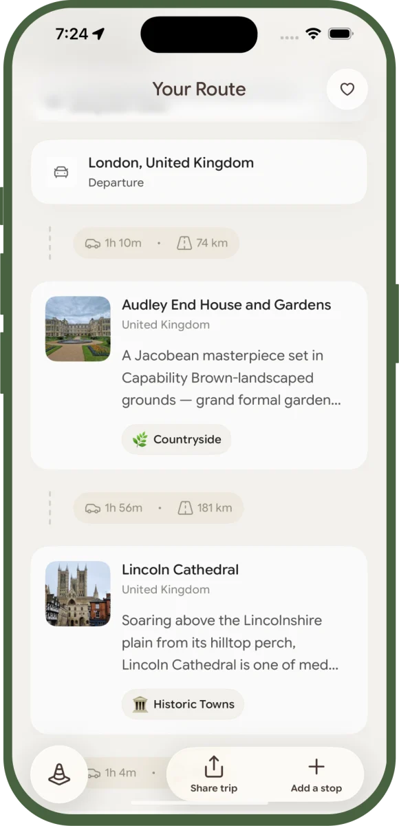
Scenic and service stops down the route, each with per-leg drive times, verified against Google Places.
Four choices did the load-bearing work: full flexibility over the AI's first answer, dragging service stops between segments (the hardest problem in the build, with ten documented dead-ends behind it), a corridor-scaled fuel pipeline where every stop is real, and visits that mark themselves by geofence while the trip's past turns read-only.
Thirteen features ship; four design choices did the load-bearing work. Each one is a problem, a choice, what we rejected, and the detail nobody sees.
The AI generates a reasonable trip; the person taking it has context the AI doesn't. The product fails if the first answer is also the final answer. Three gestures, one principle: do whatever you want, instantly, no rigid timeline. No edit-mode, no save button. Every modification triggers a real-time polyline and drive-time recalculation.
What we rejected
The recalculation isn't free: route fetching, drive-time computation, and polyline redraw all run on every modification. SwiftUI's diffing animates only the changed cards, polyline geometry is reused where the change doesn't cross a segment boundary, and the Replace sheet's alternatives are pre-cached so it opens with content already loaded.
Service stops — fuel, EV, coffee — are placed by an algorithm that maximises drive-time efficiency. But you might want fuel before the long stretch, not after. Long-press and drag, segment-aware drop, route recalculates. SwiftUI-native in the end, with everything around it doing the work. The hardest single design problem in the build.
What we rejected — 3 of 10 documented dead-ends
SwiftUI's own "which stop is being dragged" state is unreliable — it's cleared 500ms into the drag by the framework's snapshot lifecycle. Any display logic gating on it works for half a second, then fails silently. The fix was a separate drag-source ID the lifecycle doesn't touch. That single discovery accounts for about half the feature's commit history.
"Add a fuel stop" sounds simple. The optimal point in the drive doesn't always have a station. The route includes a ferry. The AI returns a "petrol station" that's a closed forecourt. Generic distance-based placement fails on every one of these. The pipeline that shipped: a distance-proportional corridor, a 5-point fan-out search, a fuel verification gate, and segment-bound exclusion.
What we rejected
The corridor isn't a circle. It's a swept area along the polyline with proportional padding, matched against actual segment projection rather than vertices only. Switching from vertex-only to segment-projection matching dropped verification overhead from 132% to 16% — the difference between fuel placement that ships and fuel placement that times out.
Marking a stop as visited shouldn't be a chore you have to remember. With Always-location granted, Scenra drops a geofence around each stop and watches for the round trip: you arrive, and the moment you cross back out, that's a confirmed visit. A push fires right then — "How was your stop at [stop name]?" — and one tap drops you onto that stop to add the photos you just took and mark it done.
From there it propagates everywhere: the timeline card shifts to past tense, the map pin gets a green check, and the web page a friend opened without the app updates too. Less a checkbox, more a quiet live activity following the trip as it happens. No Always permission? A time-based ETA gate stands in, so it still works, just without the geofence.
What we rejected
Once a stop is visited, every stop before it is in the past — and the past is read-only. You can't drag, replace, or insert before a stop you've already driven past, because editing a trip you're halfway through is incoherent. The one exception is delete, a quiet "I skipped this" cleanup. The trip stops being editable the moment it starts being real.
Plan, Companion, and Memory have all shipped — the app plans the trip, rides along, and keeps it. The roadmap is four bets deep, led by vehicle-aware routing.
The first three decisions live in Plan; the fourth — marking and memories — is Companion. Both phases have shipped, so the app now plans the trip, rides along, and keeps it.
With the lifecycle shipped, the roadmap is about depth, not phases. Four bets, in priority order.
A cold install reaches a finished trip in a median of 2 minutes 24 seconds; 72% finish onboarding and 37% generate a trip. The paywall wasn't broken, the price was: repricing ended a 34-day run of zero purchases. A vague complaint became a measured 10km corridor constraint, and a ranking collapse turned out to be the launch boost expiring — the rebuilt listing reached #1 in the UK App Store for "scenic road trip".
Shipping is where the design work starts being answerable. Every figure on this page is measured, not estimated: RevenueCat for anything involving money, PostHog for product analytics, App Store Connect for discovery.
The whole promise is a complete drive in seconds, so the number that matters is how long a stranger takes to get one. From a cold install, through onboarding, destination search, scenery selection, and AI generation, the median is 2 minutes 24 seconds — a creative tool that hands you a finished artefact inside 150 seconds.
72% of installs finish onboarding and 37% go on to generate a trip. No tutorial, no account required before the first result. For a cold-start generative tool, getting more than a third of installs to a produced artefact was the bar we designed against.
Purchases were failing at Apple's payment sheet: 22 consecutive attempts, zero completions. The obvious move is to redesign the paywall. The data said not to — 40% of paywall viewers were tapping a plan, so intent was healthy and the design was doing its job.
So we ruled things out in order. Every purchase attempt resolved cleanly, so it wasn't a technical fault. We reproduced the gate by hand on a clean install to see it. Then we benchmarked the category and found the actual answer: competitors sat at $14–$60 per year against our $120–$207 annualised. The problem was price. Weekly pricing was cut and shipped, and purchases began converting the day the new price went live — ending a 34-day run of none.
The expensive mistake would have been a paywall redesign: weeks of work aimed at a step that was already converting. The data was pointing at the step after the one everybody blames. Ruling out the obvious cause is worth more than a fast fix.
"The stops are too far off my route" is a real complaint and a useless bug report. So we built a six-corridor benchmark to put a number on it. Four of six corridors were shipping stops 13.9km to 35.8km off route.
With the problem quantified, the fix could be specific: a 10km corridor constraint applied at a single chokepoint rather than patched across the pipeline. Re-running the benchmark afterwards returned zero stops beyond 10km off route. The threshold is now the definition of correct — which means the next regression is catchable.
Organic search ranking fell away. The intuitive read is keyword decay: the terms stopped working, so rewrite them. Comparing four rank snapshots against the dates metadata had actually changed showed the ranks died inside a week with no metadata change at all. That's not decay — that's the new-app launch boost expiring on schedule.
Knowing the real cause changed the fix. Instead of rewriting keywords on instinct, we rebuilt the listing on measured competition: targeting search terms where competing apps held single-digit review counts, and avoiding the ones defended by apps with 10,000+. Scenra reached #1 in the UK App Store for "scenic road trip".
No turn-by-turn navigation, no live trip tracking yet, no deeper monetisation. What a small project says no to is half the design work.
A small team ships when scope discipline is brutal. What a project says no to is half the design work. Below: what Scenra doesn't do today, why each is a deliberate no, and what would change our minds.
A small build can't afford the wrong yes. The velocity comes from the named no's as much as the yes's: every feature deliberately left out is time spent shipping the ones that are in.
Cheddar Gorge stranded us at a hallucinated fuel stop — and built the verification pipeline; every stop is now checked against Google Places. Edinburgh ran a multi-day return with every stop real, and each trip ends as a fix list for the next build.
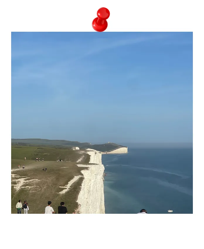
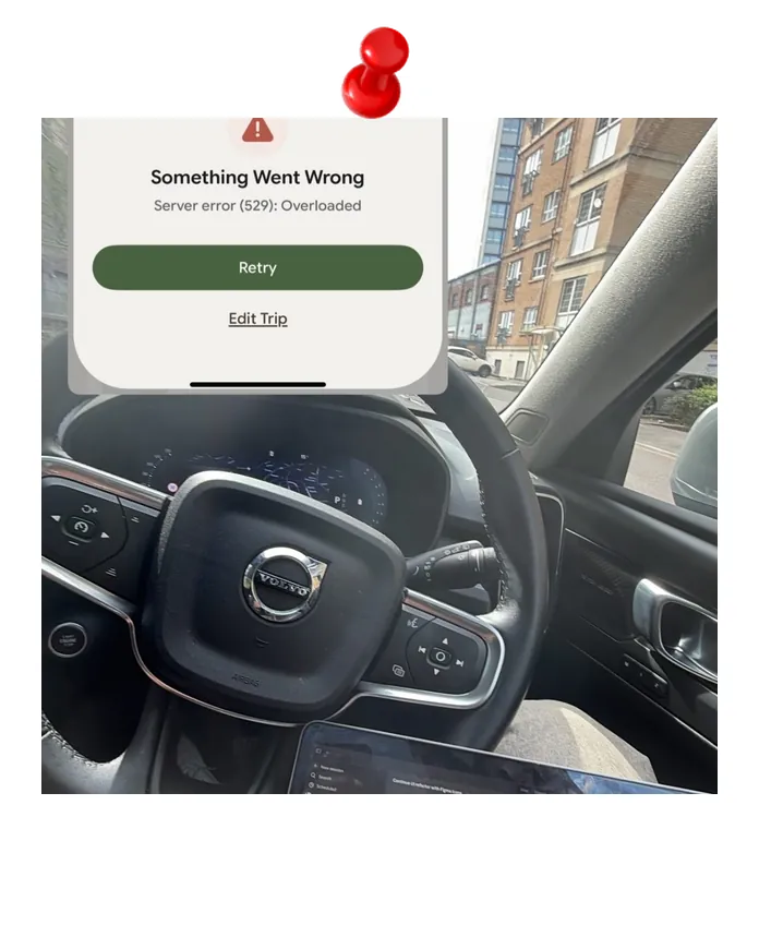
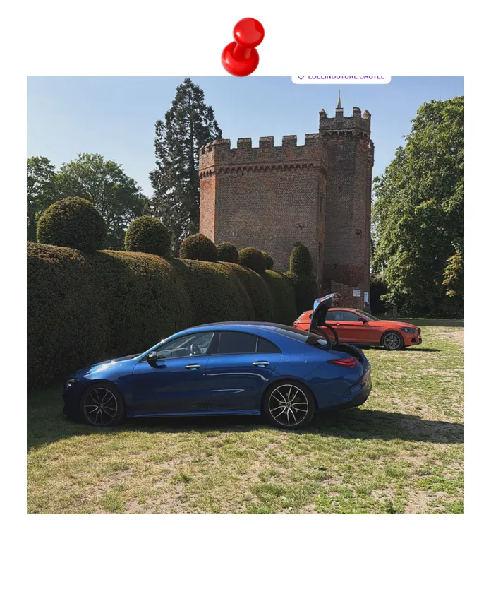
Field Notes is the proof. After the Lake District trip seeded the build, we used each beta on real drives, capturing what worked, what didn't, and what shipped after each return. Two test trips, in order — the first is the one that changed how the AI works.
The shortest meaningful test: London to Cheddar Gorge in a day. The scenic stops were real and beautiful. We were happy. Then we hit the service stop.
Claude had confidently named a fuel station, with coordinates and everything. It didn't exist. The AI had hallucinated a petrol station and dropped us in the middle of nowhere. We hadn't eaten, hadn't drunk, hadn't let Nala out — all of that was saved for the service stop. The stop was a lie.
That's not a UX bug, that's a trust loss. If someone's first real trip with Scenra ends with a hallucinated fuel stop leaving them in a lay-by, they don't come back. A real product can't ship that.
Cheddar Gorge is what built the verification pipeline. Every stop — scenic or service — is now checked against Google Places before it lands in the timeline, and unverified fuzzy matches are rejected outright. The four-step fuel pipeline in Decision 03 is that same discipline applied to service stops.
The first long beta after the verification pipeline shipped: London to Edinburgh and back, with separate scenic routes for each leg. It tested return-trip generation, the Heads Up sheet on actual ferry-flagged routes, and offline mode through rural patches. Every stop on both legs was real. The pipeline held.
Each trip ends with a list of fixes that lands in the next build. Drag-to-reposition, the Heads Up sheet redesign, the fuel-verification quality gate, the hallucination pipeline itself — all of it came from a real trip surfacing a real gap.

Scenra is a two-person project: designed together, with Moyinoluwa Olufisayo leading the engineering and Claude Code as the working partner. This page tells the story from where I sit — the trip, the product, the design decisions. Moyin's deep-dive at fisayo.me/work/scenra tells the build from the inside: the PRD discipline, the dead-ends, the commit history.